# Transitions
- Transitions allow you to gradually or smoothly change some properties from one style to another
- The transition is on a different state (like
:hover,:active,:focus,:checked, ...) of the element itself or on a different state of the parent element - Most of the properties can be changed smoothly but, the
font-familyand thebackground-imagefor example can not - Transitions are often (not always) used in combination with transformations
- The transition properties are:
| EMMET instruction | result | default | description |
|---|---|---|---|
trsp + TAB | transition-property: ; | all | property to change |
trsdu + TAB | transition-duration: ; | 0 | duration of the transition in seconds (s) or milliseconds (ms) |
trsde + TAB | transition-delay: ; | 0 | delay (s orms ) before the transition starts |
trstf + TAB | transition-timing-function: ; | ease | speed curve of the transition effect |
trs + TAB | transition: ; | shorthand for all the above properties |
# One property
- Span 1: Change the
background-colorover a period of1000ms(or1s)
span:first-child {
    transition: background-color 1000ms;
}
span:first-child:hover {
    background-color: coral;
}
1
2
3
4
5
6
2
3
4
5
6
- Span 2: Change the
border-radiusover a period of2000ms(or2s)- Notice that the
background-colorchanges immediately!
- Notice that the
span:nth-child(2) {
    transition: border-radius 2000ms;
}
span:nth-child(2):hover {
    background-color: skyblue;
    border-radius: 50%;
}
1
2
3
4
5
6
7
2
3
4
5
6
7
- Span 3: Transform (rotate and scale) the
spantag over a period of500ms(or.5s)
span:last-child {
    transition: transform 500ms;
}
span:last-child:hover {
    transform: rotate(30deg) scale(1.2);
}
1
2
3
4
5
6
2
3
4
5
6
<div>
    <span>1</span>
    <span>2</span>
    <span>3</span>
</div>
* {
    margin: 0;
    padding: 0;
    box-sizing: border-box;
}

html {
    font-size: 16px;
}

body {
    font-family: Verdana, Geneva, sans-serif;
    line-height: 1.5;
    padding: 1rem;
    text-align: center;
}

div {
    border: 1px solid darkgray;
    background-color: rgba(169, 169, 169, 0.3);
    display: inline-block;
    margin: 1rem;
}

span {
    display: inline-block;
    width: 5rem;
    line-height: 5rem;
    margin: 1rem;
    border: 1px solid #000;
    background-color: lightgreen;
}

span:first-child {
    transition: background-color 1000ms;
}

span:first-child:hover {
    background-color: coral;
}

span:nth-child(2) {
    transition: border-radius 2000ms;
}

span:nth-child(2):hover {
    background-color: skyblue;
    border-radius: 50%;
}

span:last-child {
    transition: transform 500ms;
}

span:last-child:hover {
    transform: rotate(30deg) scale(1.2);
}
REMARK
- Move the transition from the normal state to the hover state and look how the transition reacts this time
- The transition ONLY takes place when entering the
spantag and NOT when you leave thespantag!
- The transition ONLY takes place when entering the
span:last-child {
    /* transition: transform 500ms; */
}
span:last-child:hover {
    transition: transform 500ms;
    transform: rotate(30deg) scale(1.2);
}
1
2
3
4
5
6
7
2
3
4
5
6
7
# Two or more properties
- You can transition two or more CSS properties by separating them with a comma
- Span 1: Change three properties over the same period
- Span 2: Change the same three properties but with different timing
span:first-child {
    transition: background-color 1s, border-radius 1s, transform 1s;
}
span:last-child {
    transition: background-color 1s, border-radius 2s, transform 6s;
}
span:hover {
    background-color: skyblue;
    border-radius: 50%;
    transform: rotate(30deg) scale(1.5);
}
1
2
3
4
5
6
7
8
9
10
11
2
3
4
5
6
7
8
9
10
11
<div>
    <span>1</span>
    <span>2</span>
</div>
* {
    margin: 0;
    padding: 0;
    box-sizing: border-box;
}

html {
    font-size: 16px;
}

body {
    font-family: Verdana, Geneva, sans-serif;
    line-height: 1.5;
    padding: 1rem;
    text-align: center;
}

div {
    border: 1px solid darkgray;
    background-color: rgba(169, 169, 169, 0.3);
    display: inline-block;
    margin: 1rem;
}

span {
    display: inline-block;
    width: 5rem;
    line-height: 5rem;
    margin: 1rem;
    border: 1px solid #000;
    background-color: lightgreen;
}

span:first-child {
    transition: background-color 1s, border-radius 1s, transform 1s;
}

span:last-child {
    transition: background-color 1s, border-radius 2s, transform 6s;
}

span:hover {
    background-color: skyblue;
    border-radius: 50%;
    transform: rotate(30deg) scale(1.5);
}
# All properties
- When targeting all properties at once, you can use the keyword
allor just leave the keyword out becauseallis the default value
img {
    margin: 1rem;
    border: 1px solid #000;
    transition: 2s;
}
img:hover {
    filter: sepia(100%);
    opacity: .5;
    border-radius: 2rem;
    transform: rotate(180deg);
    box-shadow: 0 0 20px rgba(0, 0, 0, 1);
}
1
2
3
4
5
6
7
8
9
10
11
12
2
3
4
5
6
7
8
9
10
11
12
<figure>
  <img src="https://picsum.photos/id/102/200/200" alt="Raspberries">
</figure>
* {
    margin: 0;
    padding: 0;
    box-sizing: border-box;
}

html {
    font-size: 16px;
}

body {
    font-family: Verdana, Geneva, sans-serif;
    line-height: 1.5;
    padding: 1rem;
    text-align: center;
}

figure {
    border: 1px solid darkgray;
    background-color: rgba(169, 169, 169, 0.3);
    display: inline-block;
    padding: 1rem;
}

img {
    margin: 1rem;
    border: 1px solid #000;
    transition: 2s;
}

img:hover {
    filter: sepia(100%);
    opacity: .5;
    border-radius: 2rem;
    transform: rotate(180deg);
    box-shadow: 0 0 20px rgba(0, 0, 0, 1);
}
DESIGN TIP
For a minimalistic approach to CSS transitions:
- Use transitions purposefully, enhancing only key elements like buttons or navigation menus.
- Keep transition durations between 200ms to 500ms for quick, smooth feedback.
- Ensure consistency in transition effects across the website to maintain a cohesive user experience.
REMARK
When speed is important (e.g. on older smartphones), it's best to target all properties individually like we did in the previous example (as the all keyword loops over ALL changeable properties of the element, not only the properties you write in the hover state)
# Sequential transitions
- The
transition-delayproperty specifies the duration to wait before starting a property's transition effect
WARNING
When using the transition-duration AND the transition-delay with the shorthand property, the transition-duration ALWAYS comes first!
- In the example below, we use some of the transitions of the previous example but now in sequential order
- The transition on the
border-radiusstarts immediately and takes300ms - The transition on the
box-shadowstarts after300msand takes800ms - Then there is a pauze of
400msbecause thetransformstarts at1.5s
- The transition on the
img {
    margin: 1rem;
    border: 1px solid #000;
    transition: border-radius 300ms,
        box-shadow 800ms 300ms,
        transform 1s 1.5s;
}
1
2
3
4
5
6
7
2
3
4
5
6
7
<figure>
  <img src="https://picsum.photos/id/102/200/200" alt="Raspberries">
</figure>
* {
    margin: 0;
    padding: 0;
    box-sizing: border-box;
}

html {
    font-size: 16px;
}

body {
    font-family: Verdana, Geneva, sans-serif;
    line-height: 1.5;
    padding: 1rem;
    text-align: center;
}

figure {
    border: 1px solid darkgray;
    background-color: rgba(169, 169, 169, 0.3);
    display: inline-block;
    padding: 1rem;
}

img {
    margin: 1rem;
    border: 1px solid #000;
    transition: border-radius 300ms,
        box-shadow 800ms 300ms,
        transform 1s 1.5s;
}

img:hover {
    filter: sepia(100%);
    opacity: .5;
    border-radius: 2rem;
    transform: rotate(180deg);
    box-shadow: 0 0 20px rgba(0, 0, 0, 1);
}
# Timing function
- You can use several keywords for the
transition-timing-functionfunction- A full list can be found at the MDN web docs transition timing function page
- Default timing function is
ease - There is one special function (
cubic_bezier) which can be fully customized
- A few examples:
- All span tags behave as a block element with a default
widthof130px
(IMPORTANT: the transitions only work if you specify awidthother thanauto!) - On the hover state, the span tag grows to his full
widthof100%but every span tag has his own timing function
- All span tags behave as a block element with a default
span {
    ...
    display: block;
    width: 130px;
}
span:hover {
    width: 100%;
}
span:first-child {
    transition: width 2s linear;
}
span:nth-child(2) {
    transition: width 2s ease;
}
span:nth-child(3) {
    transition: width 2s steps(4);
}
span:nth-child(4) {
    transition: width 2s cubic-bezier(0.1, 0.7, 1.0, 0.1);
}
1
2
3
4
5
6
7
8
9
10
11
12
13
14
15
16
17
18
19
20
2
3
4
5
6
7
8
9
10
11
12
13
14
15
16
17
18
19
20
<div>
    <span>linear</span>
    <span>ease-in-out</span>
    <span>steps(4)</span>
    <span>cubic-bezier()</span>
</div>
* {
    margin: 0;
    padding: 0;
    box-sizing: border-box;
}

html {
    font-size: 16px;
}

body {
    font-family: Verdana, Geneva, sans-serif;
    line-height: 1.5;
    padding: 1rem;
}

div {
    border: 1px solid darkgray;
    background-color: rgba(169, 169, 169, 0.3);
    margin: 1rem;
    padding: .5rem;
}

span {
    margin-bottom: .5rem;
    padding: .5rem;
    border: 1px solid #000;
    background-color: skyblue;
    display: block;
    width: 130px;
}

span:hover {
    width: 100%;
}

span:first-child {
    transition: width 2s linear;
}

span:nth-child(2) {
    transition: width 2s ease-in-out;
}

span:nth-child(3) {
    transition: width 2s steps(4);
}

span:nth-child(4) {
    transition: width 2s cubic-bezier(0.1, 0.7, 1.0, 0.1);
}
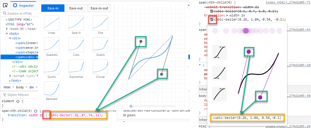
TIP: Custom cubic_bezier() timing function (optional)
- To create your own custom timing function, you can use cubic-bezier.com but it can also be done inside the browser's DevTools (Firefox: left image, Chrome: right image)
- Select one of the
spantags - Click on the icon near the timing function
- Play with the start and end handles to create your custom function
- Copy the
cubic_bezier()code and paste it in to your transition function
- Select one of the
# Targeting a child element
- Sometimes you need to move the hover state to the parent element to create an attractive effect
- When you hover the
spanelement in the bottom left corner, the transformation sometimes "shakes" a bit - Let's make the effect on the following example a bit nicer:
- Replace
span:hover {...}withdiv:hover span {...}
- Replace
div:hover span {
    transform: rotate(-45deg);
}
1
2
3
2
3
<div>
    <span>rotate(45deg)</span>
</div>
* {
  margin: 0;
  padding: 0;
  box-sizing: border-box;
}

body {
  font-family: Verdana, Geneva, sans-serif;
  line-height: 1.5;
  padding: 1rem;
  text-align: center;
}

section {
  display: flex;
  flex-wrap: wrap;
}

div {
  border: 1px solid darkgray;
  background-color: rgba(169, 169, 169, 0.42);
  display: inline-block;
  margin: 2rem;
}

span {
  display: inline-block;
  width: 150px;
  line-height: 150px;
  font-size: .9rem;
  text-align: center;
  border: 1px solid #000;
  background-color: rgba(248, 204, 52, 0.66);
  transform-origin: top right;
  transition: 1s;
}

span:hover {     /* replace with: div:hover span  */
  transform: rotate(-45deg);
}
# Example
# Rising buttons
- This page contains a basic
navbaras we saw at the Flexbox course page - When you hover an
atag, it is scaled along the X axis, moved up by.2remand it gets some new colors and a little drop shadow
nav a {
    ...
    color: floralwhite;
    border: 1px solid coral;
    transition: 300ms;
}
a:hover {
    transform: scaleX(1.05) translateY(-.2rem);
    background-color: floralwhite;
    border-color: dimgray;
    color: dimgray;
    box-shadow: 0 5px 5px rgba(0, 0, 0, .2);
}
1
2
3
4
5
6
7
8
9
10
11
12
13
2
3
4
5
6
7
8
9
10
11
12
13
<nav>
  <ul>
      <li>
          <a href="#!">HOME</a>
      </li>
      <li>
          <a href="#!">TWITTER</a>
      </li>
      <li>
          <a href="#!">SLACK</a>
      </li>
  </ul>
</nav>
* {
    margin: 0;
    padding: 0;
    box-sizing: border-box;
}

html {
    font-size: 16px;
}

body {
    font-family: Arial, "Helvetica Neue", Helvetica, sans-serif;
    line-height: 1.5;
    padding: 2rem;
    background-color: coral;
}

nav {
    font-weight: bold;
}

nav ul {
    display: flex;
    list-style-type: none;
    text-align: center;
}

nav li {
    flex: 1 1 auto;
    display: flex;
}

nav a {
    flex: 1 1 auto;
    line-height: 2;
    color: floralwhite;
    border: 1px solid coral;
    transition: 300ms;
}

a:hover {
    transform: scaleX(1.05) translateY(-.2rem);
    background-color: floralwhite;
    border-color: dimgray;
    color: dimgray;
    box-shadow: 0 5px 5px rgba(0, 0, 0, .2);
}
# Overline menu item
- When you hover an
atag, it changes colors and gets an overline.
<nav>
  <ul>
      <li>
          <a href="#!">Home</a>
      </li>
      <li>
          <a href="#!">Twitter</a>
      </li>
      <li>
          <a href="#!">Slack</a>
      </li>
  </ul>
</nav>
* {
    margin: 0;
    padding: 0;
    box-sizing: border-box;
}

html {
    font-size: 16px;
}

body {
    font-family: Arial, "Helvetica Neue", Helvetica, sans-serif;
    line-height: 1.5;
    padding: 2rem;
}

nav ul {
  list-style: none;
  display: flex;
}

nav ul li {
  margin-right: 20px;
}

nav ul li a {
  color: #333333;
  border-top: 2px solid white;
  padding-top: 7px;
  text-decoration: none;
  transition: .5s;
}

nav ul li a:hover {
  color: black;
  border-top-color: black;
}