# Images
- When you set the
widthandheightof an image in CSS, it overwrites the settings of the HTMLwidthandheightattributes - In the example below:
- The first image has only
widthandheightattributes on theimgtag (400px*300px) - The second image (
#img2) has the samewidthandheightattributes on theimgtag (400px*300px), but in CSS thewidthandheightis set to200px*150px
- The first image has only
- CONCLUSION: As soon as you write the image dimensions in CSS, you may omit the
widthandheightattributes in HTML!
<p>Lorem ipsum dolor sit amet, consectetur adipisicing elit. Quas quae, distinctio enim quasi expedita dolor, amet sunt unde. Quaerat fugiat ipsum deserunt sequi, praesentium suscipit? Id itaque delectus, quia eaque!</p>
<p>
    <img width="400" height="300" src="https://picsum.photos/id/104/400/300" alt="waves">
</p>
<p>Lorem ipsum dolor sit amet, consectetur adipisicing elit. Quas quae, distinctio enim quasi expedita dolor, amet sunt unde. Quaerat fugiat ipsum deserunt sequi, praesentium suscipit? Id itaque delectus, quia eaque!</p>
<p>
    <img id="img2" width="400" height="300" src="https://picsum.photos/id/104/400/300" alt="waves">
</p>
* {
    padding: 0;
    margin: 0;
    box-sizing: border-box;
}

html {
    font-size: 16px;
}

body {
    font-family: Verdana, Geneva, sans-serif;
    font-size: 1rem;
    line-height: 1.5;
    padding: 1rem;
}

p {
    margin-bottom: 1rem;
}

#img2 {
    width: 200px;
    height: 150px;
}
# Responsive images
- Images sometimes have very annoying side effects, even with a proper
viewportmeta tag- Left: the
widthof the image is smaller than the viewport - Middle: the
widthof the image is larger than the viewport, so a horizontal scroll bar appears (when you touch the screen) - Right: the image is made responsive, which means that the image is scaled such that its
widthfits inside the screen's viewport
- Left: the
- For a responsive image, you set
- the
max-width(orwidth) to100%- Use
max-widthif the image width can't be larger than its originalwidth - Use
widthif the image width may be larger than its originalwidth(the image is enlarged/upscaled)
- Use
- the
heighttoauto
- the
img {
    max-width: 100%;     /* use `width` instead of `max-width` if the image is also allowed to scale up */
    height: auto;
}
1
2
3
4
2
3
4
- Open this pen in a new browser window to see the difference between the two images
<h1>Responsive images</h1>
<figure>
    <img src="https://picsum.photos/id/1043/400/300" alt="forest">
    <figcaption>Responsive image with <span>max-width: 100%</span></figcaption>
</figure>
<figure>
    <img class="max" src="https://picsum.photos/id/1043/400/300" alt="forest">
    <figcaption>Responsive image with <span>width: 100%</span></figcaption>
</figure>
* {
    padding: 0;
    margin: 0;
    box-sizing: border-box;
}

html {
    font-size: 16px;
}

body {
    font-family: Verdana, Geneva, sans-serif;
    line-height: 1.5;
    padding: 1rem;
}

h1, figure {
    margin-bottom: 1rem;
}

img {
    max-width: 100%;
    height: auto;
}

.max {
    width: 100%;
}

figcaption span {
    font-family: monospace;
    font-weight: bold;
    color: white;
    background-color: steelblue;
    padding: .3rem;
}
REMARK
Be careful with width: 100% as upscaling images always comes with quality loss
# Crop/resize images
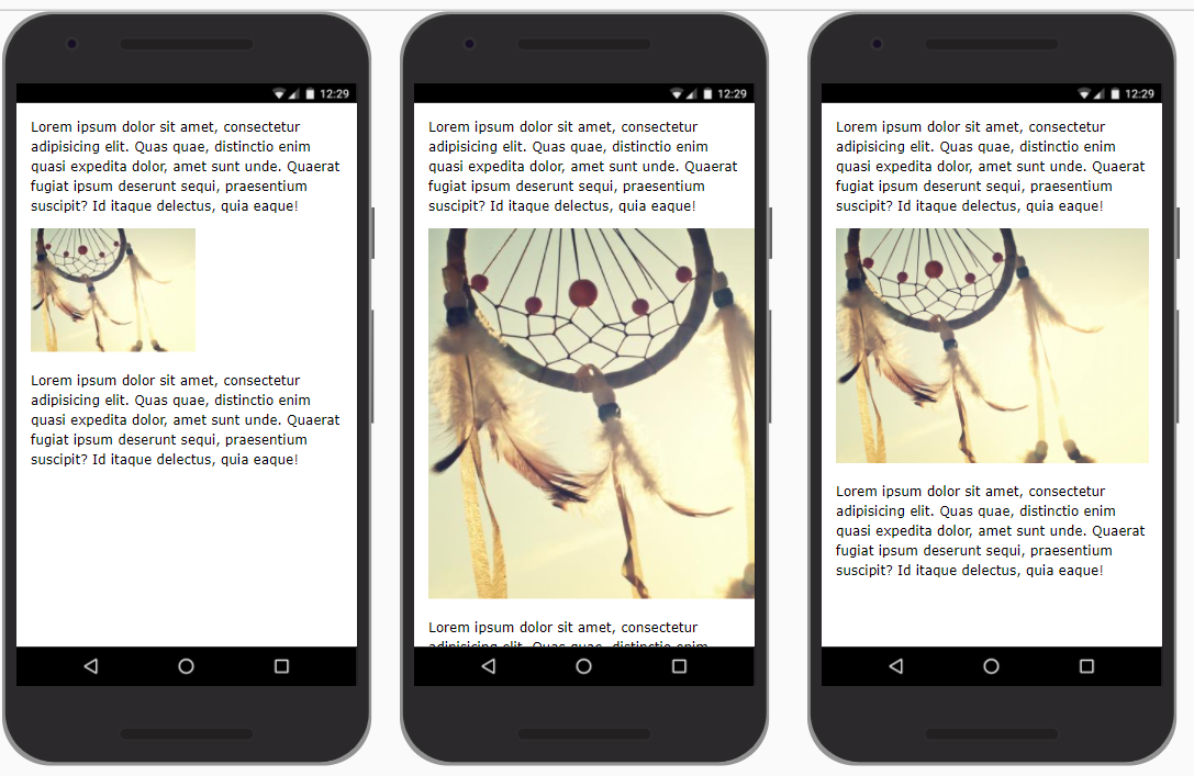
- First, take a quick look at the example: images with different breakpoint
- On a small and large screen, all images are in landscape mode and are responsive
- On a medium screen, all images are in portret mode and have a fixed
widthandheight
- There are two ways to accomplish this:
- The hard way with Photoshop and JavaScript 😏
- Open Photoshop and make two versions for every image (a landscape version and a portret version)
- Add some JavaScript to switch between the different image versions at different breakpoints
- The easy way with pure CSS 😃
- Use the CSS property
object-fitto crop and/or resize the original image on different breakpoints - Use the CSS property
object-positionto position the cropped image
- Use the CSS property
- The hard way with Photoshop and JavaScript 😏
- Let's start with a simple example to explain these two properties
<h1>Image crop/resize with object-fit</h1>
<figure>
    <img src="https://picsum.photos/id/1005/270/180" alt="person">
    <img src="https://picsum.photos/id/1011/600/200" alt="kayak">
    <img src="https://picsum.photos/id/1074/300/500" alt="lion">
    <figcaption>Default: <span>object-fit: fill;</span></figcaption>
</figure>
<figure class="contain">
    <img src="https://picsum.photos/id/1005/270/180" alt="person">
    <img src="https://picsum.photos/id/1011/600/200" alt="kayak">
    <img src="https://picsum.photos/id/1074/300/500" alt="kayak">
    <figcaption><span>object-fit: contain;</span></figcaption>
</figure>
<figure class="none">
    <img src="https://picsum.photos/id/1005/270/180" alt="person">
    <img src="https://picsum.photos/id/1011/600/200" alt="kayak">
    <img src="https://picsum.photos/id/1074/300/500" alt="kayak">
    <figcaption><span>object-fit: none;</span></figcaption>
</figure>
<figure class="cover">
    <img src="https://picsum.photos/id/1005/270/180" alt="person">
    <img src="https://picsum.photos/id/1011/600/200" alt="kayak">
    <img src="https://picsum.photos/id/1074/300/500" alt="kayak">
    <figcaption><span>object-fit: cover;</span></figcaption>
</figure>
<figure class="position">
    <img src="https://picsum.photos/id/1005/270/180" alt="person">
    <img src="https://picsum.photos/id/1011/600/200" alt="kayak">
    <img src="https://picsum.photos/id/1074/300/500" alt="kayak">
    <figcaption><span>object-fit: none; object-position: top left;</span></figcaption>
</figure>
* {
    padding: 0;
    margin: 0;
    box-sizing: border-box;
}

body {
    font-size: 16px;
}

body {
    font-family: Verdana, Geneva, sans-serif;
    line-height: 1.5;
    padding: 1rem;
}

h1 {
    margin-bottom: 1rem;
}

figure {
    margin-bottom: 2rem;
}

figcaption span {
    font-family: monospace;
    font-weight: bold;
    color: white;
    background-color: steelblue;
    padding: .3rem;
}

img {
    border: 1px solid #000;
    background-color: #f5a1a1;
    margin: 0 1rem 1rem 0;
    width: 300px;
    height: 200px;
}

.contain img {
    object-fit: contain;
}

.none img {
    object-fit: none;
}

.cover img {
    object-fit: cover;
}

.position img {
    object-fit: none;
    object-position: top left;
}
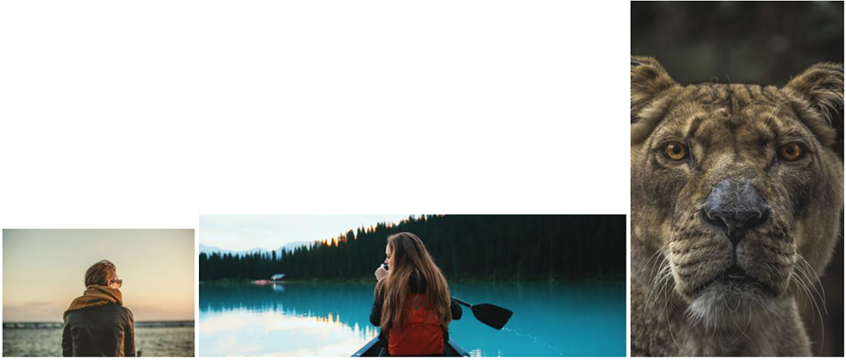
- Let's start with three images with different dimensions
- Left image:
270px*180px - Middle image:
600px*200px - Right image:
300px*500px
- Left image:
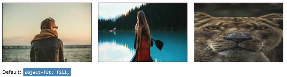
# object-fit: fill (default)
- Give all images a fixed
widthandheight
img {
    width: 300px;
    height: 200px;
}
1
2
3
4
2
3
4
- Only the first image looks fine because it has the same aspect ratio as the CSS properties
- The two other images are scaled but squeezed/stretched to fit into the image box
- If you don't specify the
object-fitproperty, the browser usesobject-fit: fill;as the default setting
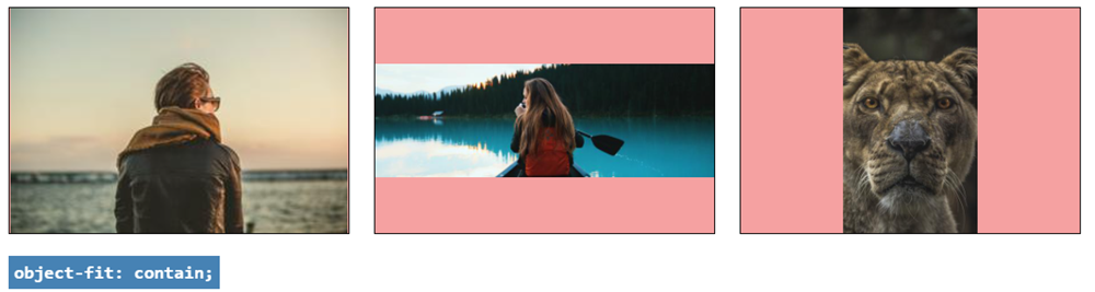
# object-fit: contain
- All images are scaled to fit into the image box but maintain their original aspect ratio
img {
    width: 300px;
    height: 200px;
    object-fit: contain;
}
1
2
3
4
5
2
3
4
5
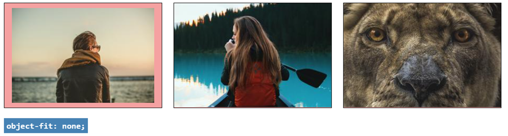
# object-fit: none
- Only images that are larger than the box dimensions are scaled down to fit into the image box
- All images maintain their aspect ratio, but some parts are clipped
img {
    width: 300px;
    height: 200px;
    object-fit: none;
}
1
2
3
4
5
2
3
4
5
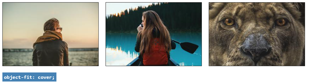
# object-fit: cover (most used)
- All images are scaled up or down to fit into the image box
- All images maintain their aspect ratio, but some parts are clipped
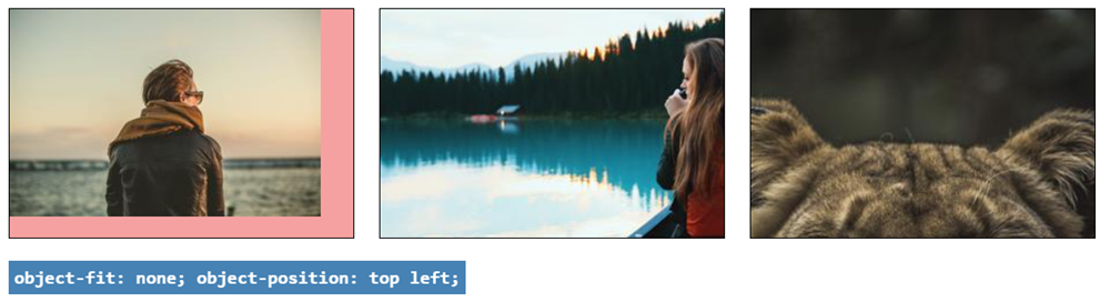
# object-position
- As you can see in the above examples, images are centered (both horizontally and vertically) by default
- You can change the position with the
object-positionproperty, e.g:
img {
    width: 300px;
    height: 200px;
    object-fit: none;
    object-position: top left;
}
1
2
3
4
5
6
2
3
4
5
6
- The values for
object-position(see also interactive example) are the same as forbackground-position:- first value for vertical positioning:
top,center,bottomor use fixed units likepx,%, ... - second value for horizontal positioning:
left,center,rightor use fixed units likepx,%, ... - horizontal and vertical positioning values are interchangeable:
object-position: top left;=object-position: left top;
- first value for vertical positioning:
# Example
<div class="container">
    <h1>Images with different breakpoints</h1>
    <figure>
        <img src="https://picsum.photos/id/1015/300/200" alt="nature1">
        <img src="https://picsum.photos/id/1016/300/200" alt="nature2">
        <img src="https://picsum.photos/id/1019/300/200" alt="nature3">
        <img src="https://picsum.photos/id/1022/300/200" alt="nature4">
    </figure>
</div>
* {
    padding: 0;
    margin: 0;
    box-sizing: border-box;
}

body {
    font-size: 16px;
}

body {
    font-family: Verdana, Geneva, sans-serif;
    line-height: 1.5;
    padding: 1rem;
    background-color: lightblue;
}

.container {
    padding: 1rem;
    margin: 2rem auto;
    border: 1px solid #000;
    background-color: whitesmoke;
}

h1 {
    font-size: 1.5rem;
    margin-bottom: 1rem;
    text-align: center;
}

figure {
    text-align: center;
}

img {
    width: 100%;
    height: auto;
}

@media screen and (min-width: 600px) {
    body {
        background-color: #D5D971;
    }

    img {
        width: 125px;
        height: 200px;
        object-fit: cover;
    }
}

@media screen and (min-width: 800px) {
    body {
        background-color: #f1c6b1;
    }

    img {
        width: 45%;
        height: auto;
    }
}
# Small screen (below 600px)
- All images are responsive
img {
    width: 100%;
    height: auto;
}
1
2
3
4
2
3
4
# Medium screen (between 600px and 800px)
- All images
- have a fixed
widthandheight - are cropped symmetrically (around the center/middle)
- have a fixed
img {
    width: 125px;
    height: 200px;
    object-fit: cover;
}
1
2
3
4
5
2
3
4
5
# Larger screen (above 800px)
- All images are responsive again
img {
    width: 45%;
    height: auto;
}
1
2
3
4
2
3
4
# Oversized background image on body
TIP
Just as for images, you can also control the size/fit and positioning of background images
- For size/fit:
element sizing possible values image object-fitcontain,cover,fillandnonebackground image background-sizeonly containandcover(and values inpxor%)- For positioning:
element positioning possible values image object-positiontop,center,bottom,left,right,px,%,...background image background-positiontop,center,bottom,left,right,px,%,...
- The following example/exercise demonstrates how to set a fixed, oversized background image on the
body(or on thehtmlelement) - Let's start with a
background-colorand abackground-imageof800px*600pxon the body- As you now know from a previous chapter, the background will copy itself horizontally and vertically
- Open the pen below in full screen mode to see the effect
<h1>Full page background</h1>
<div>
    <p>Lorem ipsum dolor sit amet, consectetur adipisicing elit. Fugiat labore rerum ea rem sed nesciunt veniam incidunt vitae quidem facilis odio, similique enim autem dicta, libero illo amet tempora soluta.</p>
</div>
* {
    padding: 0;
    margin: 0;
    box-sizing: border-box;
}

html {
    font-size: 16px;
}

body {
    font-family: Verdana, Geneva, sans-serif;
    line-height: 1.5;
    padding: 1rem;
    background-color: #bcbb9d;
    background-image: url(https://picsum.photos/id/100/800/600);
    /* background-size: cover; */
    /* background-attachment: fixed; */
    /* background-position: top center; */
}

h1 {
    margin-bottom: 1rem;
}

div {
    background-color: rgba(255, 255, 255, .2);
    padding: 1rem;
    height: 110vh;
    border: 1px solid #000;
}
# Exercise
- Follow these three steps to transform the background into a static, fullscreen background image
- Cover the background with the whole image:
background-size: cover;- Depending on the size of the browser window, you only see a small portion of the original image
- By default, you see the top left corner of the image
- Fix the background image (so it doesn't scroll with the content of the page) with
background-attachment: fixed; - Position the background image, e.g.
background-position: top center;
- Cover the background with the whole image:
REMARKS
- To limit the loading time of web pages, it is best practice not to use too large background images: background images must remain below 200kB
- Always make sure that the
background-colormatches the colour tones in thebackground-image, so that a suiting colour is shown when loading the page - If you study the CSS code in detail, you notice that the
divon the page gets aheightof110vhor 110% of the viewport height. As such, thedivis taller than the screen and a scrollbar will be shown. Read more on viewport units (viewport heightvh, viewport widthvw, ...) in CSS Viewport Units: A Quick Start.
| EMMET instruction | result |
|---|---|
bga + TAB | background-attachment: ; |
bga:f + TAB | background-attachment: fixed; |
bgp + TAB | background-position: 0 0; |
# Filters
- One of the nice recent features in CSS3 is the addition of filters on images which reduces the need to use photo editing programs

- Some examples:
| function | values |
|---|---|
blur() | px |
brightness() | from 0% to 100% (or from 0 to1) |
contrast() | % |
grayscale() | from 0% to 100% (or from 0 to1) |
invert() | from 0% to 100% (or from 0 to1) |
opacity() | from 0% to 100% (or from 0 to1) |
saturate() | from 0% to 100% (or from 0 to1) |
sepia() | from 0% to 100% (or from 0 to1) |
hue-rotate() | ..deg |
drop-shadow() | hoff voff blur color |
<h1>Filters</h1>
<figure>
    <img class="blur" src="https://picsum.photos/id/28/250/250" alt="">
    <figcaption><span>blur(3px)</span></figcaption>
</figure>
<figure>
    <img class="brightness" src="https://picsum.photos/id/281/250/250" alt="">
    <figcaption><span>brightness(.7)</span></figcaption>
</figure>
<figure>
    <img class="contrast" src="https://picsum.photos/id/289/250/250" alt="">
    <figcaption><span>contrast(200%)</span></figcaption>
</figure>
<figure>
    <img class="grayscale" src="https://picsum.photos/id/287/250/250" alt="">
    <figcaption><span>grayscale(80%)</span></figcaption>
</figure>
<figure>
    <img class="invert" src="https://picsum.photos/id/292/250/250" alt="">
    <figcaption><span>invert(.8)</span></figcaption>
</figure>
<figure>
    <img class="opacity" src="https://picsum.photos/id/299/250/250" alt="">
    <figcaption><span>opacity(25%)</span></figcaption>
</figure>
<figure>
    <img class="saturate" src="https://picsum.photos/id/292/250/250" alt="">
    <figcaption><span>saturate(30%)</span></figcaption>
</figure>
<figure>
    <img class="sepia" src="https://picsum.photos/id/292/250/250" alt="">
    <figcaption><span>sepia(100%)</span></figcaption>
</figure>
<figure>
    <img class="hue-rotate" src="https://picsum.photos/id/306/250/250" alt="">
    <figcaption><span>hue-rotate(90deg)</span></figcaption>
</figure>
<figure>
    <img class="drop-shadow" src="https://picsum.photos/id/30/430/250" alt="">
    <figcaption><span>drop-shadow(.5rem .5rem 5px rgba(0, 0, 0, .7))</span></figcaption>
</figure>
* {
    padding: 0;
    margin: 0;
    box-sizing: border-box;
}

html {
    font-size: 16px;
}

body {
    font-family: Verdana, Geneva, sans-serif;
    line-height: 1.5;
    padding: 1rem;
}

h1 {
    margin-bottom: 1rem;
}

figure {
    display: inline-block;
    text-align: center;
    margin-bottom: 2rem;
}

.blur {
    filter: blur(3px);
}

.brightness {
    filter: brightness(.7);
}

.contrast {
    filter: contrast(200%);
}

.grayscale {
    filter: grayscale(80%);
}

.invert {
    filter: invert(.8);
}

.opacity {
    filter: opacity(25%);
}

.saturate {
    filter: saturate(30%);
}

.sepia {
    filter: sepia(100%);
}

.hue-rotate {
    filter: hue-rotate(90deg);
}

.drop-shadow {
    filter: drop-shadow(.5rem .5rem 5px rgba(0, 0, 0, .7));
}

figcaption span {
    font-family: monospace;
    font-weight: bold;
    color: white;
    background-color: steelblue;
    padding: .3rem;
}
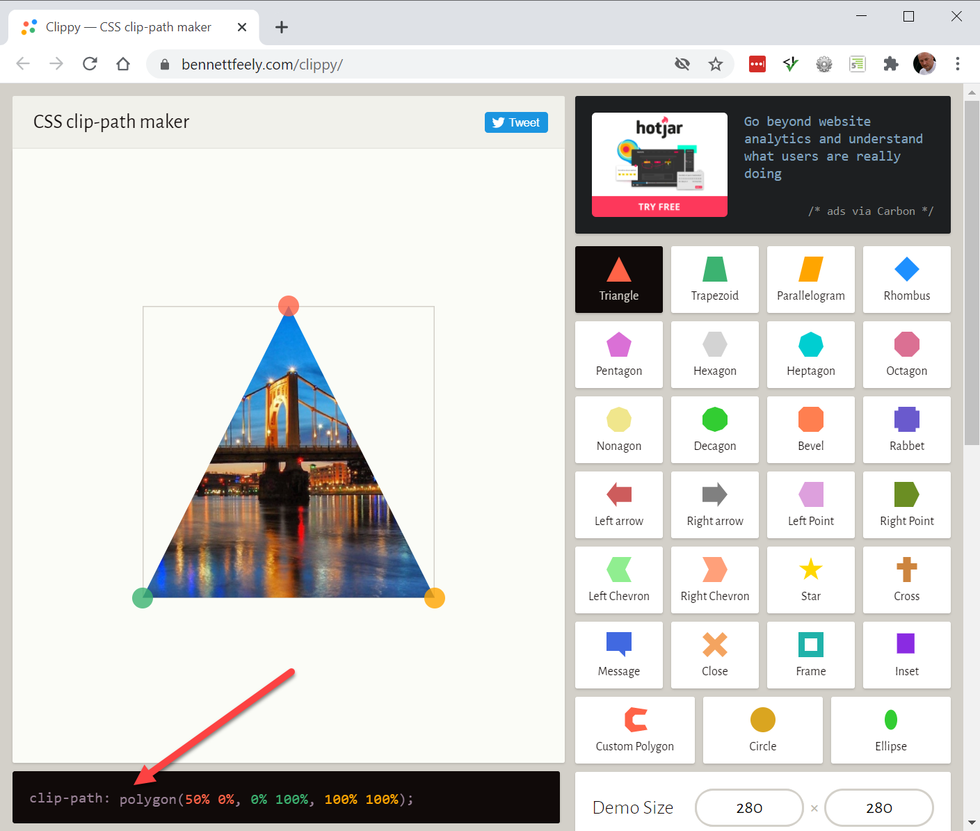
# Clipping path
- Another new, but not yet widely supported feature is
clip-path

- A good site to help you in creating such a
clip-pathis https://bennettfeely.com/clippy/- A number of sample images are used in combination with predefined shapes that you can adjust
- Keep a close eye on the dimensions of the image you want to clip
- The code you need to copy into CSS can be found at the bottom left
    Clipping path
<figure>
    <img src="https://picsum.photos/id/402/60/280" alt="">
    <img class="t" src="https://picsum.photos/id/34/198/280" alt=""><img class="f" src="https://picsum.photos/id/397/132/280" alt="">
</figure>
* {
    padding: 0;
    margin: 0;
    box-sizing: border-box;
}

html {
    font-size: 16px;
}

body {
    font-family: Verdana, Geneva, sans-serif;
    line-height: 1.5;
    padding: 1rem;
}

h1 {
    margin-bottom: 1rem;
}

img {
    margin-right: 1rem;
}

.t {
    clip-path: polygon(0 0,
            100% 0,
            100% 20%,
            65% 20%,
            65% 100%,
            35% 100%,
            35% 20%,
            0% 20%);
}

.f {
    clip-path: polygon(0 0,
            100% 0,
            100% 20%,
            45% 20%,
            45% 35%,
            100% 35%,
            100% 55%,
            45% 55%,
            45% 100%,
            0% 100%);
}
REMARK
For Safari users, the clip-path statement has to be preceded by a similar line with the vendor prefix -webkit, as this property is not yet fully supported by Safari. For example:
.t {
    -webkit-clip-path: polygon(0 0, 100% 0, 100% 20%, 65% 20%, 65% 100%, 35% 100%, 35% 20%, 0% 20%);
    clip-path: polygon(0 0, 100% 0, 100% 20%, 65% 20, 65% 100%, 35% 100%, 35% 20%, 0% 20%);
}
1
2
3
4
2
3
4