# Display
# Block - inline - none
- HTML knows only two display types: block elements and inline elements
- With CSS the (default) display type can be changed to more than 20 other types
- In this section, we only discuss the four most frequently used display types (
block,ìnlineinline-blockandnone) - A fifth frequently used display type (
flex) will be discussed in detail on the Flexbox page
| value | example element | width | height | padding | margin |
|---|---|---|---|---|---|
block | <div>, <p>, <h1>, <h2>, ..., <h6>, <hr>, ... | yes | yes | yes | yes |
inline | <span>, <a>, <strong>, <img> *, ... | no * | no * | yes + | yes + |
inline-block | yes | yes | yes | yes | |
none | no | no | no | no |
* <img>
The image tag behaves somewhat different than most of the inline elements: while an inline element can't have a value for width and height, the img tag can!
+ padding and margin on inline elements
paddingandmarginof inline elements only generate horizontal distance;
vertically inline elements overlap with the existing content- Again, the
imgelement, for which vertical distance is generated withpaddingandmargin, is the exception - Change
inlineelements toinline-blockto get the same effect (also vertical padding and margin) as for images
| EMMET instruction | result |
|---|---|
d + TAB | display:block; |
d:b + TAB | display:block; |
d:i + TAB | display:inline; |
d:ib + TAB | display:inline-block; |
d:n + TAB | display:none; |
# Example 1
- The example below contains a number of block elements and inline elements
- Block elements are visualised with an orange
outline - Inline elements are visualised with a green
outline
- Block elements are visualised with an orange
<h1>block vs inline elements</h1>
<div>
    <p>Lorem ipsum dolor sit amet, <a href="#!">anker tag</a> elit. Saepe eius, laudantium perspiciatis neque est aspernatur sit rem, nulla tempore voluptates dolores quae ut a facere impedit placeat totam, quibusdam tempora sequi deserunt, commodi magni. <strong>strong text</strong> aut ab error incidunt, voluptatibus libero. Assumenda quo in quas nemo libero eligendi, delectus.</p>
    <p>Repellendus commodi, fugit nesciunt inventore odio beatae praesentium soluta explicabo, consequuntur obcaecati sapiente <span>span tag</span>, incidunt labore eius accusamus sed saepe culpa enim eaque aperiam debitis quos. Voluptatibus autem quam, eveniet quae nisi eum ullam quaerat necessitatibus voluptas! Voluptatibus facilis ratione provident optio minus, aut eligendi, cum deserunt ea.</p>
    <p>Earum possimus soluta cupiditate enim vel quod repellendus alias blanditiis placeat nisi dicta aliquid nostrum dolor dignissimos <img width="200" height="200" src="https://picsum.photos/id/125/200/200" alt="nature"> praesentium, amet sint! Enim dolore error itaque asperiores molestiae aspernatur reprehenderit culpa ullam fugiat a placeat quibusdam sunt, sequi dolorem id, minima amet ex odit. Consectetur ex excepturi atque aut, quod in doloremque?</p>
</div>
html {
    font-size: 16px;
}

body {
    font-family: Verdana, Geneva, sans-serif;
    line-height: 1.5;
    padding: 2rem;
}

h1, p {
    outline: solid 5px rgba(252, 196, 107, 0.8);
}

strong, span, a, img {
    padding: 1rem;
    margin: 1rem;
    width: 200px;
    height: 200px;
    outline: solid 5px rgba(136, 252, 107, 0.8);
}
# Use cases
# display: block
- Change the display of an
inlineelement to ablockelement - Return to the default value after
display: none;
# display: inline
- Change the display of an
blockelement to ainlineelement - Return to the default value after
display: none;
# display: none
- Hide an element on different breakpoints or on
media="print"
# Example 2
- The most important elements in this example are:
- the navigation
navwhich consists of someatags (inline elements) next to each other - the footer
footer(block element)
- the navigation
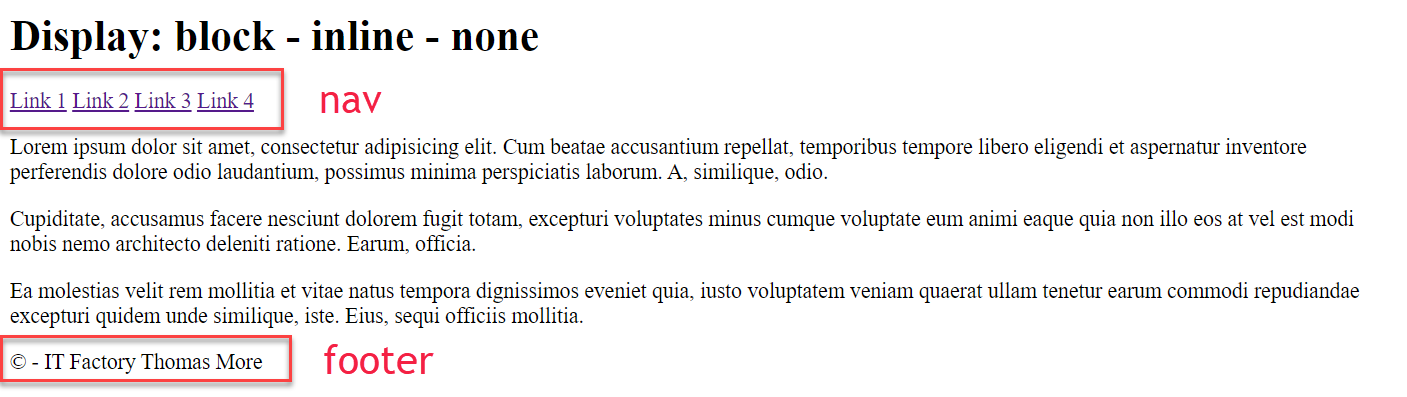
# Small screen (below 600px)
- On a small screen, the links appear beneath each other
(Allatags are converted toblockelements) - The
footerwill only appear on the printed version
(Thefootertag is hidden)
a {
  color: whitesmoke;
  background-color: #638c99;
  border: 1px solid #638c99;
  font-weight: bold;
  text-decoration: none;
  display: block;
  padding: 0.5rem 1rem;
  margin: 0;
}

footer {
  border-top: solid 1px black;
  text-align: right;
  display: none;
}
1
2
3
4
5
6
7
8
9
10
11
12
13
14
15
16
2
3
4
5
6
7
8
9
10
11
12
13
14
15
16
# Larger screen (above 600px)
- On a larger screen, the links will appear next to each other
(Allatags are converted back toinlineelements)
a {
  display: inline;
}
1
2
3
2
3
# For print
- Hide the navigation
- Show the
footer
nav {
  display: none;
}

footer {
  display: block;
}
1
2
3
4
5
6
7
2
3
4
5
6
7
# Example 3
- The most important tag in this example is the
h2tag
<h2 class="hideOnPrint">
    This is a
    <span class="showOnSmall">small</span>
    <span class="showOnMedium">medium</span>
    <span class="showOnLarge">large</span>
    screen
</h2>
1
2
3
4
5
6
7
2
3
4
5
6
7
| small.css | medium.css | large.css | |
|---|---|---|---|
| .showOnSmall | display: none; | ||
| .showOnMedium | display: none; | display: inline; | display: none; |
| .showOnLarge | display: none; | display: inline; |
# Small screen (below 600px)
- The
showOnMediumandshowOnLargeclasses set thedisplayof the correspondingspanelements tonone-> the word 'small' is shown in theh2element
.showOnMedium,
.showOnLarge {
    display: none;
}
1
2
3
4
2
3
4
# Medium screen (between 600px and 800px)
- The
showOnSmallclass sets thedisplayof the correspondingspanelement tonone; theshowOnMediumclass sets/overrides thedisplayof the correspondingspanelement toinline-> the word 'medium' is shown in theh2element
.showOnSmall {
    display: none;
}

.showOnMedium {
    display: inline;
}
1
2
3
4
5
6
7
2
3
4
5
6
7
# Large screen (above 800px)
- The
showOnMediumclass sets/overrides thedisplayof the correspondingspanelements tonone; theshowOnLargeclass sets thedisplayof the correspondingspanelement toinline-> the word 'large' is shown in theh2element
.showOnMedium {
    display: none;
}

.showOnLarge {
   display: inline;
}
1
2
3
4
5
6
7
2
3
4
5
6
7
# For print
- The
hideOnPrintclass sets thedisplayof theh2element tonone-> theh2element is not shown
.hideOnPrint {
    display: none;
}
1
2
3
2
3
# Visibility
- There are two ways to hide elements from the DOM:
- With the style rule
display: none: the content is not visible and the original spot collapses
(applied to the second paragraph in the example below)
  p.paragraph2 {
      display: none;
  }
1
2
3- With the style rule
visibility: hidden: the content is not visible, but leaves a gap!
(applied to the fourth paragraph in the example below)
   p.paragraph4 {
        visibility: hidden;
   }
1
2
3 - With the style rule
# Example
<div>
    <p><span>1</span> Lorem ipsum dolor sit amet, consectetur adipisicing elit. Animi, rem! Tenetur, quod asperiores, aut minus repellendus reprehenderit obcaecati at commodi deserunt hic repudiandae ratione totam esse, magnam quasi corporis explicabo!</p>
    <p class="paragraph2"><span>2</span> Vel aspernatur harum ea provident fugiat quae quasi officia sunt ipsum suscipit unde, dignissimos voluptatem dolor optio magni, incidunt ad odio. Quidem, assumenda. Tempore alias, ab natus ad autem iste.</p>
    <p><span>3</span> Ut laboriosam facere amet quidem totam vel, distinctio aspernatur! Quos quae, eos iure, minus necessitatibus rerum at rem libero velit asperiores modi cumque deleniti obcaecati atque numquam, aperiam molestiae fugiat.</p>
    <p class="paragraph4"><span>4</span> Libero quam illo omnis minus iure qui quasi, dolorum modi numquam quos. Alias architecto aut excepturi aperiam dolorum vero maiores culpa dolor, eaque fugiat, soluta non hic asperiores atque ullam.</p>
    <p><span>5</span> Esse quo consequatur inventore, pariatur vel sit sapiente nesciunt minima mollitia voluptates voluptas harum officia debitis nemo suscipit rerum accusamus distinctio id impedit. Alias aliquam, perspiciatis vero illo officia pariatur!</p>
</div>
* {
    padding: 0;
    margin: 0;
    box-sizing: border-box;
}

html {
    font-size: 16px;
}

body {
    font-family: Verdana, Geneva, sans-serif;
    line-height: 1.5;
    padding: 1rem;
    background-color: lightgoldenrodyellow;
}

p {
    background-color: floralwhite;
    padding: 1rem;
    margin-bottom: 1rem;
    border: 1px solid indianred;
}

p span {
    display: inline-block;
    background-color: indianred;
    color: floralwhite;
    width: 1.5rem;
    text-align: center;
}

p.paragraph2 {
    display: none;
}

p.paragraph4 {
    visibility: hidden;
}
# Inline block
inline-blockis mostly used to change an inline element so that the padding and margings can be fully used (i.e. not only for horizontal distance, but also for vertical spacing above and below the element)
# Example 1: banner
- Open this pen in a separate window
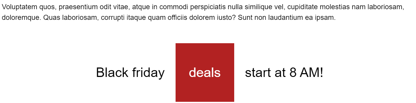
<p>Lorem ipsum dolor sit amet, consectetur adipisicing elit. Rerum distinctio veniam ipsam repellendus provident, suscipit tempore, molestias eveniet at optio ab alias repellat, eum autem illum amet voluptate officiis, quisquam!</p>
<p class="friday">Black friday <span>bargains</span> start at 8 AM!</p>
<p>Molestias distinctio, autem sed voluptates, ut similique facere tempore impedit laborum voluptatem, accusamus expedita provident maiores dolorum. Minus sed unde rem nobis dolor, recusandae delectus, in, minima et explicabo atque.</p>
<p class="friday">Black friday <span id="sales">sales</span> start at 8 AM!</p>
<p>Voluptatem quos, praesentium odit vitae, atque in commodi perspiciatis nulla similique vel, cupiditate molestias nam laboriosam, doloremque. Quas laboriosam, corrupti itaque quam officiis dolorem iusto? Sunt non laudantium ea ipsam.</p>
<p class="friday">Black friday <span id="deals">deals</span> start at 8 AM!</p>
<p>Lorem ipsum dolor sit amet, consectetur adipisicing elit. Rerum distinctio veniam ipsam repellendus provident, suscipit tempore, molestias eveniet at optio ab alias repellat, eum autem illum amet voluptate officiis, quisquam!</p>
html {
    font-size: 16px;
}

body {
    font-family: Arial, "Helvetica Neue", Helvetica, sans-serif;
    line-height: 1.5;
}

p.friday {
    font-size: 30px;
    text-align: center;
}

p.friday span {
    background-color: firebrick;
    color: white;
    width: 100px;
    height: 100px;
    padding: 1rem;
    margin: 1rem;
}

p.friday span#sales {
    display: inline-block;
}

p.friday span#deals {
    display: inline-block;
    line-height: 100px;
}
# Bargains label
p.friday {
    font-size: 30px;
    text-align: center;
}

p.friday span {
    background-color: firebrick;
    color: white;
    width: 100px;
    height: 100px;
    padding: 1rem;
    margin: 1rem;
}
1
2
3
4
5
6
7
8
9
10
11
12
13
2
3
4
5
6
7
8
9
10
11
12
13
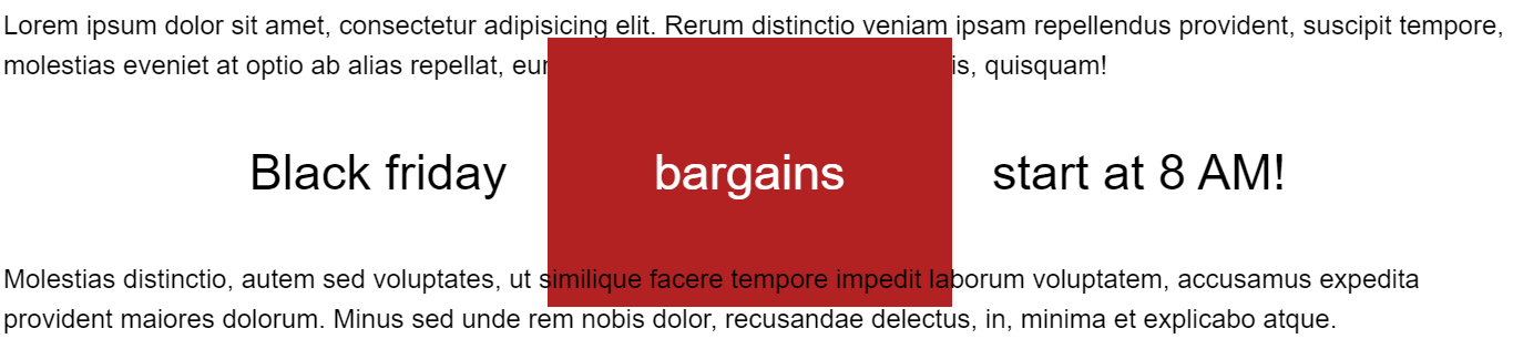
- bargains is a default
spantag- The
widthandheightare set on (thespanin)p.friday, but this has NO effect on an inline element! - The
paddingandmarginare also set on (thespanin)p.friday, but this has only effect in a horizontal direction
- The
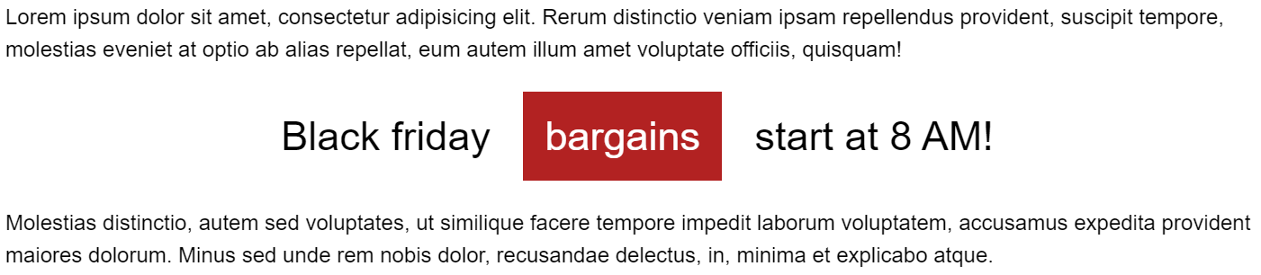
- Change the
paddingtemporarily to4remand see what happens (in the vertical direction)
# Sales label
p.friday span#sales {
    display: inline-block;
}
1
2
3
2
3
- The
spantag is transformed intoinline-block - Both
width,heightandmarginare visible in the vertical direction
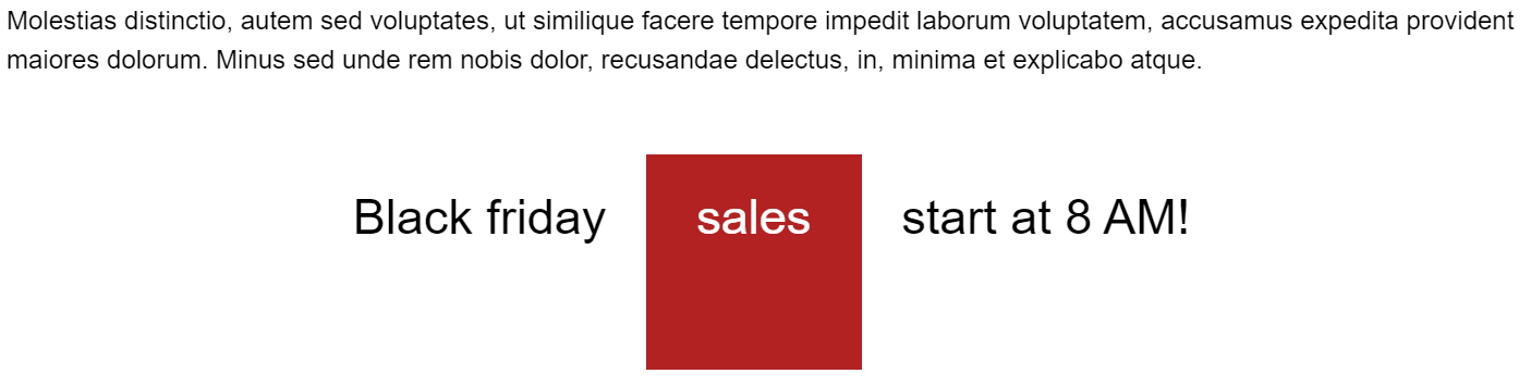
- Change the
paddingtemporarily to4rem, no overlap this time
# Deals label
p.friday span#deals {
    display: inline-block;
    line-height: 100px;
}
1
2
3
4
2
3
4
- Set the
line-heightequal to theheightof the box to center the text within the box
# Example 2: right align figcaption
- As confirmed in the example below,
figureandfigcaptionare block elements - The image is an
inlineelement - If you align the
figcaptionto theright, it will not appear under the image but on the far right of the screen
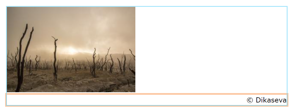
<figure>
    <img src="https://picsum.photos/id/1028/300/200" alt="Nature">
    <figcaption>© Dikaseva</figcaption>
</figure>
* {
    padding: 0;
    margin: 0;
    box-sizing: border-box;
}

html {
    font-size: 16px;
}

body {
    font-family: Verdana, Geneva, sans-serif;
    line-height: 1.5;
    padding: 1rem;
}

figure {
    /* display: inline-block; */
    outline: 2px solid rgba(106, 212, 250, 0.6);
}

figcaption {
    text-align: right;
    outline: 4px solid rgba(250, 165, 106, 0.6);
}
- You can easily fix this by changing the value of the
displayproperty of thefiguretag toinline-block
figure {
    display: inline-block;
    outline: 2px solid rgba(106, 212, 250, 0.61);
}
1
2
3
4
2
3
4

# Example 3: from link to button
- As you already know, links (
a) are inline elements - To change the layout of a link to a button (with paddings and/or margins), we need to switch its display to
inline-block - The other properties are for decorative purposes only
a {
    display: inline-block;
    padding: .75rem 2rem;
    text-decoration: none;
    font-weight: bold;
    color: #295fc2;
    background-color: #8cc115;
    border: .25rem solid #8cc115;
}
1
2
3
4
5
6
7
8
9
2
3
4
5
6
7
8
9
<div class="container">
    <p>Lorem ipsum dolor sit amet, consectetur adipisicing elit. Quas quae, distinctio enim quasi expedita dolor, amet sunt unde. Quaerat fugiat ipsum deserunt sequi, praesentium suscipit? Id itaque delectus, quia eaque!</p>
    <p>
        <a href="#!">button 1</a>
        <a href="#!">button 2</a>
        <a href="#!">button 3</a>
        <a href="#!">button 4</a>
    </p>
    <p>Odit repellat accusantium earum quod natus laudantium voluptatem, recusandae, omnis porro voluptates quisquam soluta error nulla voluptas sunt! Esse voluptates a odio doloribus voluptatum eaque dignissimos, harum neque sed quas?</p>
</div>
* {
    padding: 0;
    margin: 0;
    box-sizing: border-box;
}

body {
    font-family: Verdana, Geneva, sans-serif;
    padding: 2rem;
    background-color: #c7d7f5;
}

.container {
    width: 700px;
    margin: 0 auto;
}

p {
    margin-bottom: 1rem;
}

a {
    display: inline-block;
    padding: .75rem 2rem;
    text-decoration: none;
    font-weight: bold;
    color: #295fc2;
    background-color: #8cc115;
    border: .25rem solid #8cc115;
}

a:hover {
    background-color: #b7ee3d;
}