# Media queries revisited
# Media queries in HTML
- Up to now, you wrote your media queries in HTML, as explained in HTML > Towards CSS > Media queries
- Add a
mediaattribute in thelinktag to a styleheet (in theheadpart of your HTML page), where you test for a device type (screen,print, ...), possibly followed byandand a feature between curved brackets
<head>
  <meta name="viewport" content="width=device-width, initial-scale=1.0">
  <link rel="stylesheet" href="yellow.css" media="screen and (min-width: 500px)">
  ...
</head>
1
2
3
4
5 - Add a
# Example
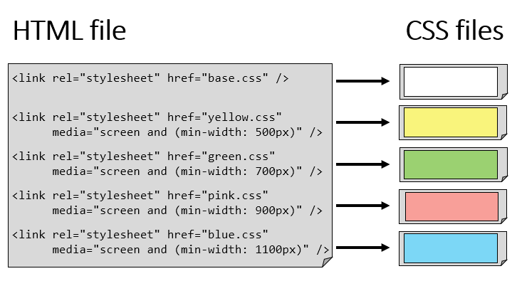
- In this example, we have 4 breakpoints and 5 CSS files
- The file base.css (universal reset, basic styling, ...) is always loaded/applied
- Depending on the screen width, additional CSS files (yellow.css, green.css, ...) are being loaded/applied using a mobile first approach!

# Media queries in CSS
- From now on, you can also code your media queries in CSS
- You start with
@mediaand a device type (screen,print, ...), possibly followed byandand a feature between curved brackets
@media screen and (min-width: 500px){
   ...
}
1
2
3- As such, you need only 1 CSS file
- A similar approach is also used in existing grid systems (e.g. Bootstrap)
- You start with
# Example
<h1>Media queries in CSS</h1>
<p>Lorem ipsum dolor sit amet, consectetur adipisicing elit. Illo harum pariatur tenetur quia expedita ratione animi quas nihil asperiores blanditiis laudantium iusto dolor, inventore doloribus!</p>
<p>Corporis eos ipsa sapiente voluptatem hic eligendi consequuntur amet quod quasi voluptatum. Atque voluptates, facere unde perferendis magnam, dicta incidunt! Atque, ad vitae excepturi ratione?</p>
<p>Quod vel officiis quae numquam beatae dicta cumque assumenda, nam dolorum aperiam ut alias odio libero aut unde repellendus. Non, molestias aliquam! Reprehenderit, ex, dignissimos!</p>
* {
    padding: 0;
    margin: 0;
    box-sizing: border-box;
}

html {
    font-size: 15px;
}

body {
    font-family: Verdana, Geneva, sans-serif;
    line-height: 1.5;
    color: #000;
}

h1 {
    margin: 1rem;
}

p {
    border: 1px solid black;
    padding: 1rem;
    margin: 1rem;
}

@media screen and (min-width: 500px) {
    body {
        background-color: #f9f47c;
    }
}

@media screen and (min-width: 700px) {
    body {
        background-color: #9bd171;
    }
}

@media screen and (min-width: 900px) {
    body {
        background-color: #f89f99;
    }
}

@media screen and (min-width: 1100px) {
    body {
        background-color: #7cd7f6;
    }
}
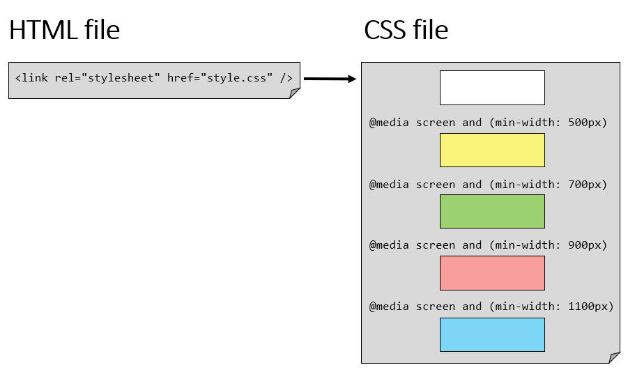
- In this example, we have the same 4 breakpoints as in the previous example, but only 1 CSS file!
- The first part of the CSS code (universal reset, basic styling, ...) is always applied
- Depending on the screen width, additional CSS style rules are being applied using a mobile first approach!

REMARKS
- If you want to implement specific style rules for printing your webpages, use
@media print{ ... }in a similar way - Again, the mobile first approach is preferred. First write the style rules for all screen sizes, after which you design specifically for increasing screen sizes using the
min-widthfeature. - Do not forget the viewport meta tag which remains necessary in order for these media queries to work correctly!
# Which method to choose?
- The advantage of the first method (Media queries in HTML), where multiple CSS files are linked in your HTML file, is that the device will only load the CSS file(s) that are needed.
Yet, the downside is that each CSS file is loaded separately from the webserver, causing a lot of server requests when experimenting with and/or changing the screen size. Furthermore, you need to maintain different CSS files. - The advantage of the second method (Media queries in CSS), where only 1 CSS file is linked, is that it only needs 1 server request.
On the other hand, this CSS file will be completely downloaded irrespective of the screen size, which implies that some superfluous CSS code will be transferred as well. - Both methods are used, but the second method (media queries in CSS) is usually preferred for maintenance reasons, as all style rules are centralised in 1 file