# Flexbox
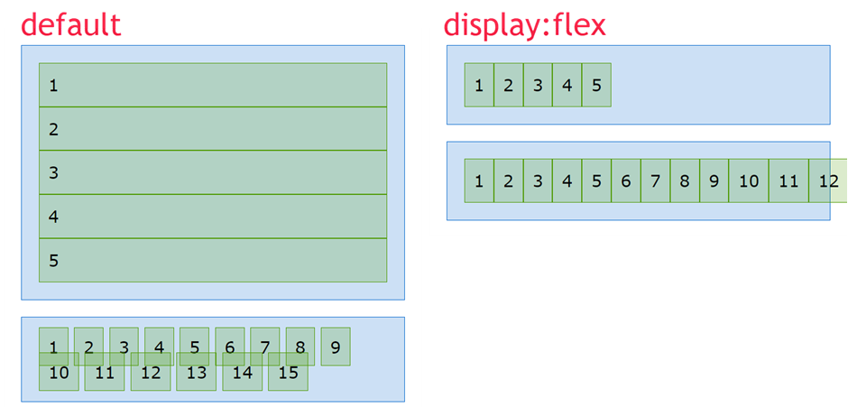
- As we saw earlier in this course,
display: flex(a.k.a. flexbox) is one of the possible display types - The idea behind the CSS Flexible Box Layout Module is that you should be able to spread all parts of a web page horizontally and vertically with a "flexible flow"
- Almost all modern CSS frameworks like Bootstrap and Materialize use flexbox to position elements on a page (e.g. grid, cards, navigation bars, ...)
- When you set an element to
display:flexonly the element itself (the flex container) and its DIRECT children (flex items) are affected!

- Before we discuss the different properties of the flex container and the flex items, let's look what happens when you add
display: flexto the.parentclass
<div class="parent">
    <div class="child">1</div>
    <div class="child">2</div>
    <div class="child">3</div>
    <div class="child">4</div>
    <div class="child">5</div>
</div>
<div class="parent">
    <span class="child">1</span>
    <span class="child">2</span>
    <span class="child">3</span>
    <span class="child">4</span>
    <span class="child">5</span>
    <span class="child">6</span>
    <span class="child">7</span>
    <span class="child">8</span>
    <span class="child">9</span>
    <span class="child">10</span>
    <span class="child">11</span>
    <span class="child">12</span>
    <span class="child">13</span>
    <span class="child">14</span>
    <span class="child">15</span>
</div>
* {
    padding: 0;
    margin: 0;
    box-sizing: border-box;
}

html {
    font-size: 16px;
}

body {
    font-family: Verdana, Geneva, sans-serif;
    line-height: 1.5;
}

.parent {
    /* display: flex; */
    padding: 1rem;
    margin: 1rem;
    border: 1px solid #0066CC;
    background-color: rgba(0, 102, 204, 0.2);
}

.child {
    padding: .5rem;
    border: 1px solid #4D9900;
    background-color: rgba(77, 153, 0, 0.2);
}
REMARKS
- It doesn't matter if the flex item is a block element (
div,hx,p, ...) or an inline element (span,img, ...). When you setdisplay: flex, all flex items behave exactly the same!- Because all flex items behave the same, we will discuss the different properties of flexbox using
divtags
- Because all flex items behave the same, we will discuss the different properties of flexbox using
- If the flex item elements have no
width/height, they collapse to their actual content
# Flex container (parent)
# flex-wrap
- The
flex-wrapproperty determines how the flex items behave if they don't fit inside the flex container
| EMMET instruction | result | description |
|---|---|---|
fxw:n + TAB | flex-wrap: nowrap; | (default) all flex items overflow the flex container |
fxw:w + TAB | flex-wrap: wrap; | all flex items wrap into the flex container |
fxw:wr + TAB | flex-wrap: wrap-reverse; | all flex items wrap into the flex container, but in reverse order |
<h1>flex-wrap: nowrap;</h1>
<div class="parent">
    <div class="child">1</div>
    <div class="child">2</div>
    <div class="child">3</div>
    <div class="child">4</div>
    <div class="child">5</div>
    <div class="child">6</div>
    <div class="child">7</div>
    <div class="child">8</div>
    <div class="child">9</div>
    <div class="child">10</div>
    <div class="child">11</div>
    <div class="child">12</div>
    <div class="child">13</div>
    <div class="child">14</div>
    <div class="child">15</div>
</div>
<h1>flex-wrap: wrap;</h1>
<div class="parent wrap">
    <div class="child">1</div>
    <div class="child">2</div>
    <div class="child">3</div>
    <div class="child">4</div>
    <div class="child">5</div>
    <div class="child">6</div>
    <div class="child">7</div>
    <div class="child">8</div>
    <div class="child">9</div>
    <div class="child">10</div>
    <div class="child">11</div>
    <div class="child">12</div>
    <div class="child">13</div>
    <div class="child">14</div>
    <div class="child">15</div>
</div>
<h1>flex-wrap: wrap-reverse;</h1>
<div class="parent wrap-reverse">
    <div class="child">1</div>
    <div class="child">2</div>
    <div class="child">3</div>
    <div class="child">4</div>
    <div class="child">5</div>
    <div class="child">6</div>
    <div class="child">7</div>
    <div class="child">8</div>
    <div class="child">9</div>
    <div class="child">10</div>
    <div class="child">11</div>
    <div class="child">12</div>
    <div class="child">13</div>
    <div class="child">14</div>
    <div class="child">15</div>
</div>
* {
    padding: 0;
    margin: 0;
    box-sizing: border-box;
}

html {
    font-size: 16px;
}

body {
    font-family: Verdana, Geneva, sans-serif;
    line-height: 1.5;
}

h1 {
    font-size: 1rem;
    margin: 1rem;
}

.parent {
    display: flex;
    flex-wrap: nowrap; /* default value */
    padding: 1rem;
    margin: 1rem;
    border: 1px solid #0066CC;
    background-color: rgba(0, 102, 204, 0.2);
}

.wrap {
    flex-wrap: wrap;
}

.wrap-reverse {
    flex-wrap: wrap-reverse;
}

.child {
    padding: .5rem;
    border: 1px solid #4D9900;
    background-color: rgba(77, 153, 0, 0.2);
}
# flex-direction
- The
flex-directionproperty determines how the flex items are placed inside the flex container
| EMMET instruction | result | description |
|---|---|---|
fxd:r + TAB | flex-direction: row; | (default) all flex items are placed in a row from left to right |
fxd:rr + TAB | flex-direction: row-reverse; | all flex items are placed in a row from right to left |
fxd:c + TAB | flex-direction: column; | all flex items are placed in a column from top to bottom |
fxd:cr + TAB | flex-direction: column-reverse; | all flex items are placed in a column from bottom to top |
<h1>flex-direction: row;</h1>
<div class="parent">
    <div class="child">1</div>
    <div class="child">2</div>
    <div class="child">3</div>
    <div class="child">4</div>
    <div class="child">5</div>
    <div class="child">6</div>
    <div class="child">7</div>
    <div class="child">8</div>
    <div class="child">9</div>
    <div class="child">10</div>
    <div class="child">11</div>
    <div class="child">12</div>
    <div class="child">13</div>
    <div class="child">14</div>
    <div class="child">15</div>
</div>
<h1>flex-direction: row-reverse;</h1>
<div class="parent row-reverse">
    <div class="child">1</div>
    <div class="child">2</div>
    <div class="child">3</div>
    <div class="child">4</div>
    <div class="child">5</div>
    <div class="child">6</div>
    <div class="child">7</div>
    <div class="child">8</div>
    <div class="child">9</div>
    <div class="child">10</div>
    <div class="child">11</div>
    <div class="child">12</div>
    <div class="child">13</div>
    <div class="child">14</div>
    <div class="child">15</div>
</div>
<h1>flex-direction: column;</h1>
<div class="parent column">
    <div class="child">1</div>
    <div class="child">2</div>
    <div class="child">3</div>
    <div class="child">4</div>
    <div class="child">5</div>
    <div class="child">6</div>
    <div class="child">7</div>
    <div class="child">8</div>
    <div class="child">9</div>
    <div class="child">10</div>
    <div class="child">11</div>
    <div class="child">12</div>
    <div class="child">13</div>
    <div class="child">14</div>
    <div class="child">15</div>
</div>
<h1>flex-direction: column-reverse;</h1>
<div class="parent column-reverse">
    <div class="child">1</div>
    <div class="child">2</div>
    <div class="child">3</div>
    <div class="child">4</div>
    <div class="child">5</div>
    <div class="child">6</div>
    <div class="child">7</div>
    <div class="child">8</div>
    <div class="child">9</div>
    <div class="child">10</div>
    <div class="child">11</div>
    <div class="child">12</div>
    <div class="child">13</div>
    <div class="child">14</div>
    <div class="child">15</div>
</div>
* {
    padding: 0;
    margin: 0;
    box-sizing: border-box;
}

html {
    font-size: 16px;
}

body {
    font-family: Verdana, Geneva, sans-serif;
    line-height: 1.5;
}

h1 {
    font-size: 1rem;
    margin: 1rem;
}

.parent {
    display: flex;
    flex-wrap: wrap;
    flex-direction: row;   /* default value */
    padding: 1rem;
    margin: 1rem;
    border: 1px solid #0066CC;
    background-color: rgba(0, 102, 204, 0.2);
}

.row-reverse {
    flex-direction: row-reverse;
}

.column {
    flex-direction: column;
}

.column-reverse {
    flex-direction: column-reverse;
}

.child {
    padding: .5rem;
    border: 1px solid #4D9900;
    background-color: rgba(77, 153, 0, 0.2);
}
REMARKS
- When you set the
flex-directiontocolumnorcolumn-reverse, all flex items span the total width of the flex container - When dealing with flexboxes, we are not speaking of a horizontal/vertical direction, but of a main axis/cross axis

- The other flex properties (
flex-wrap,justify-content,align-items,align-content) basically behave the same for theflex-directionsettingsroworcolumn, but the lay-out may look very different
# flex-flow (shorthand)
flex-flowis just a shorthand forflex-directionandflex-wrap. The order of the values does not matter. For example:flex-flow: row wrap;flex-flow: column-reverse wrap-reverse;
# justify-content (main axis)
- The
justify-contentproperty determines how the flex items are distributed along the main axis of the flex container - The table below contains the most used (not all) values for this property
| EMMET instruction | result | description |
|---|---|---|
jc:fs + TAB | justify-content: flex-start; | (default) all flex items are placed towards the start of the main axis |
jc:fe + TAB | justify-content: flex-end; | all flex items are placed towards the end of the main axis |
jc:c + TAB | justify-content: center; | all flex items are placed around the center of the main axis |
jc:sb + TAB | justify-content: space-between; | distribute all flex items evenly on the main axis (the first flex item is placed at the start of the main axis, the last flex item is placed at the end of the main axis) |
jc:sa + TAB | justify-content: space-around; | distribute all flex items evenly on the main axis (flex items have a half-size space on either end) |
justify-content: space-evenly; | distribute all flex items evenly on the main axis (flex items have an equal space between them) |
<h1>justify-content: flex-start;</h1>
<div class="parent">
    <div class="child">1</div>
    <div class="child">2</div>
    <div class="child">3</div>
    <div class="child">4</div>
</div>
<h1>justify-content: flex-end;</h1>
<div class="parent flex-end">
    <div class="child">1</div>
    <div class="child">2</div>
    <div class="child">3</div>
    <div class="child">4</div>
</div>
<h1>justify-content: center;</h1>
<div class="parent center">
    <div class="child">1</div>
    <div class="child">2</div>
    <div class="child">3</div>
    <div class="child">4</div>
</div>
<h1>justify-content: space-between;</h1>
<div class="parent space-between">
    <div class="child">1</div>
    <div class="child">2</div>
    <div class="child">3</div>
    <div class="child">4</div>
</div>
<h1>justify-content: space-around;</h1>
<div class="parent space-around">
    <div class="child">1</div>
    <div class="child">2</div>
    <div class="child">3</div>
    <div class="child">4</div>
</div>
<h1>justify-content: space-evenly;</h1>
<div class="parent space-evenly">
    <div class="child">1</div>
    <div class="child">2</div>
    <div class="child">3</div>
    <div class="child">4</div>
</div>
* {
    padding: 0;
    margin: 0;
    box-sizing: border-box;
}

html {
    font-size: 16px;
}

body {
    font-family: Verdana, Geneva, sans-serif;
    line-height: 1.5;
}

h1 {
    font-size: 1rem;
    margin: 1rem;
}

.parent {
    display: flex;
    justify-content: flex-start;    /* default value */
    /* padding: 1rem; */
    margin: 1rem;
    border: 1px solid #0066CC;
    background-color: rgba(0, 102, 204, 0.2);
}

.flex-end {
    justify-content: flex-end;
}

.center {
    justify-content: center;
}

.space-between {
    justify-content: space-between;
}

.space-around {
    justify-content: space-around;
}

.space-evenly {
    justify-content: space-evenly;
}

.child {
    padding: .5rem;
    border: 1px solid #4D9900;
    background-color: rgba(77, 153, 0, 0.2);
}
REMARK 1
- By adding some extra content to one of the flex items, all flex items are stretched along the cross axis
- This (default) behavior will be discussed in more detail in the next part on the
align-itemsproperty
- This (default) behavior will be discussed in more detail in the next part on the
<div class="parent">
    <div class="child">1</div>
    <div class="child">2<br>a<br>b<br>c</div>
    <div class="child">3</div>
    <div class="child">4</div>
</div>
* {
    padding: 0;
    margin: 0;
    box-sizing: border-box;
}

html {
    font-size: 16px;
}

body {
    font-family: Verdana, Geneva, sans-serif;
    line-height: 1.5;
}

h1 {
    font-size: 1rem;
    margin: 1rem;
}

.parent {
    display: flex;
    padding: 1rem;
    margin: 1rem;
    border: 1px solid #0066CC;
    background-color: rgba(0, 102, 204, 0.2);
}

.child {
    padding: .5rem;
    border: 1px solid #4D9900;
    background-color: rgba(77, 153, 0, 0.2);
}
REMARK 2
- When setting the
flex-directiontocolumn, it seems thatjustify-contentbehaves very differently- This can be confusing at first sight, but this behavior is very normal at this point (as the flex items are stretched along the cross-axis by default)
<h1>justify-content: space-between</h1>
<h2>flex-direction: row</h2>
<div class="parent">
    <div class="child">1</div>
    <div class="child">2</div>
    <div class="child">3</div>
</div>
<h2>flex-direction: column</h2>
<div class="parent column">
    <div class="child">1</div>
    <div class="child">2</div>
    <div class="child">3</div>
</div>
* {
    padding: 0;
    margin: 0;
    box-sizing: border-box;
}

html {
    font-size: 16px;
}

body {
    font-family: Verdana, Geneva, sans-serif;
    line-height: 1.5;
}

h1 {
    font-size: 1rem;
    margin: 1rem;
}

h2 {
    font-size: .8rem;
    margin: 1rem;
}

.parent {
    display: flex;
    justify-content: space-between;
    padding: 1rem;
    margin: 1rem;
    border: 1px solid #0066CC;
    background-color: rgba(0, 102, 204, 0.2);
}

.column {
    flex-direction: column;
}

.child {
    padding: .5rem;
    border: 1px solid #4D9900;
    background-color: rgba(77, 153, 0, 0.2);
}
- The flex CONTAINER has no
widthorheightexplicitly set, so it uses the default values of thedivtag- The default
widthof thedivtag is 100% - The default
heightfits the height of its content
- The default
flex-direction: row- The main axis corresponds to the
width, so the content is divided over the full 100%width - The cross axis corresponds to the
height, so every flex item is stretched to fill thisheight
- The main axis corresponds to the
flex-direction: column- The main axis corresponds to the
height, so the content is divided over thisheight - The cross axis corresponds to the
width, so every flex item is stretched to the full 100%width
- The main axis corresponds to the
- If you explicitly set the
widthandheightof the flex container, you get this result:
.parent {
    width: 200px;
    height: 200px;
    display: flex;
    ...
}
2
3
4
5
6
<h1>justify-content: space-between</h1>
<h2>flex-direction: row</h2>
<div class="parent">
    <div class="child">1</div>
    <div class="child">2</div>
    <div class="child">3</div>
</div>
<h2>flex-direction: column</h2>
<div class="parent column">
    <div class="child">1</div>
    <div class="child">2</div>
    <div class="child">3</div>
</div>
* {
    padding: 0;
    margin: 0;
    box-sizing: border-box;
}

html {
    font-size: 16px;
}

body {
    font-family: Verdana, Geneva, sans-serif;
    line-height: 1.5;
}

h1 {
    font-size: 1rem;
    margin: 1rem;
}

h2 {
    font-size: .8rem;
    margin: 1rem;
}

.parent {
    width: 200px;
    height: 200px;
    display: flex;
    justify-content: space-between;
    padding: 1rem;
    margin: 1rem;
    border: 1px solid #0066CC;
    background-color: rgba(0, 102, 204, 0.2);
}

.column {
    flex-direction: column;
}

.child {
    padding: .5rem;
    border: 1px solid #4D9900;
    background-color: rgba(77, 153, 0, 0.2);
}
REMARK 3
- Until now, we never set
width/heighton the flex ITEMS- These properties can also be used to influence the lay-out
- You can, for example, add these properties to make every flex item a square box with centered text:
.child {
    width: 2rem;
    height: 2rem;
    text-align: center;
    line-height: 1;
    ...
}
2
3
4
5
6
7
<h1>justify-content: space-between</h1>
<h2>flex-direction: row</h2>
<div class="parent">
    <div class="child">1</div>
    <div class="child">2</div>
    <div class="child">3</div>
</div>
<h2>flex-direction: column</h2>
<div class="parent column">
    <div class="child">1</div>
    <div class="child">2</div>
    <div class="child">3</div>
</div>
* {
    padding: 0;
    margin: 0;
    box-sizing: border-box;
}

html {
    font-size: 16px;
}

body {
    font-family: Verdana, Geneva, sans-serif;
    line-height: 1.5;
}

h1 {
    font-size: 1rem;
    margin: 1rem;
}

h2 {
    font-size: .8rem;
    margin: 1rem;
}

.parent {
    width: 12rem;
    height: 12rem;
    display: flex;
    justify-content: space-between;
    padding: 1rem;
    margin: 1rem;
    outline: 1px solid #0066CC;
    background-color: rgba(0, 102, 204, 0.2);
    background-size: 1rem 1rem;
    background-image:
        linear-gradient(rgba(0, 0, 255, .3), transparent 1px),
        linear-gradient(90deg, rgba(0, 0, 255, .3), transparent 1px);
}

.column {
    flex-direction: column;
}

.child {
    width: 2rem;
    height: 2rem;
    text-align: center;
    line-height: 1;
    padding: .5rem;
    border: 1px solid #4D9900;
    background-color: rgba(77, 153, 0, 0.2);
}
# align-items (cross axis)
align-itemsdistributes all flex items along the cross axis (just likejustify-contentdoes for the main axis)- Some of the
align-itemsvalues (flex-start,flex-endandcenter) react the same as the values forjustify-content - The table below contains the most used (not all) values for this property
| EMMET instruction | result | description |
|---|---|---|
ai:s + TAB | align-items: stretch; | (default) all flex items are equally stretched on the cross axis |
ai:fs + TAB | align-items: flex-start; | all flex items are placed towards the start of the cross axis |
ai:fe + TAB | align-items: flex-end; | all flex items are placed towards the end of the cross axis |
ai:c + TAB | align-items: center; | all flex items are placed around the center of the cross axis |
ai:b + TAB | align-items: baseline; | all flex items are placed on the font baseline on the cross axis |
REMARKS
- The
align-itemsproperty can be used when theflex-wrapproperty is set towrapor tonowrap- In the example below we use
flex-wrap: wrap;to illustrate the difference with thealign-contentproperty (that will be introduced further on)
- In the example below we use
- To demonstrate one of the values (
align-items: baseline;) we give the second and third flex item a differentfont-size
.parent {
    height: 20rem;
    display: flex;
    flex-flow: row wrap;
    ...
}
.child {
    padding: .5rem;
    border: 1px solid #4D9900;
    background-color: rgba(77, 153, 0, 0.2);
}

.child:nth-child(2) {
    font-size: 2rem;
}

.child:nth-child(3) {
    font-size: 1.5rem;
}
2
3
4
5
6
7
8
9
10
11
12
13
14
15
16
17
18
19
<h1>align-items</h1>
<h2>align-items: stretch;</h2>
<div class="parent">
    <div class="child">1</div>
    <div class="child">2</div>
    <div class="child">3</div>
    <div class="child">4</div>
    <div class="child">5</div>
    <div class="child">6</div>
    <div class="child">7</div>
    <div class="child">8</div>
    <div class="child">9</div>
    <div class="child">10</div>
    <div class="child">11</div>
    <div class="child">12</div>
    <div class="child">13</div>
    <div class="child">14</div>
    <div class="child">15</div>
    <div class="child">16</div>
    <div class="child">17</div>
    <div class="child">18</div>
    <div class="child">19</div>
    <div class="child">20</div>
    <div class="child">21</div>
    <div class="child">22</div>
    <div class="child">23</div>
    <div class="child">24</div>
    <div class="child">25</div>
</div>
<h2>align-items: flex-start;</h2>
<div class="parent flex-start">
    <div class="child">1</div>
    <div class="child">2</div>
    <div class="child">3</div>
    <div class="child">4</div>
    <div class="child">5</div>
    <div class="child">6</div>
    <div class="child">7</div>
    <div class="child">8</div>
    <div class="child">9</div>
    <div class="child">10</div>
    <div class="child">11</div>
    <div class="child">12</div>
    <div class="child">13</div>
    <div class="child">14</div>
    <div class="child">15</div>
    <div class="child">16</div>
    <div class="child">17</div>
    <div class="child">18</div>
    <div class="child">19</div>
    <div class="child">20</div>
    <div class="child">21</div>
    <div class="child">22</div>
    <div class="child">23</div>
    <div class="child">24</div>
    <div class="child">25</div>
</div>
<h2>align-items: flex-end;</h2>
<div class="parent flex-end">
    <div class="child">1</div>
    <div class="child">2</div>
    <div class="child">3</div>
    <div class="child">4</div>
    <div class="child">5</div>
    <div class="child">6</div>
    <div class="child">7</div>
    <div class="child">8</div>
    <div class="child">9</div>
    <div class="child">10</div>
    <div class="child">11</div>
    <div class="child">12</div>
    <div class="child">13</div>
    <div class="child">14</div>
    <div class="child">15</div>
    <div class="child">16</div>
    <div class="child">17</div>
    <div class="child">18</div>
    <div class="child">19</div>
    <div class="child">20</div>
    <div class="child">21</div>
    <div class="child">22</div>
    <div class="child">23</div>
    <div class="child">24</div>
    <div class="child">25</div>
</div>
<h2>align-items: center;</h2>
<div class="parent center">
    <div class="child">1</div>
    <div class="child">2</div>
    <div class="child">3</div>
    <div class="child">4</div>
    <div class="child">5</div>
    <div class="child">6</div>
    <div class="child">7</div>
    <div class="child">8</div>
    <div class="child">9</div>
    <div class="child">10</div>
    <div class="child">11</div>
    <div class="child">12</div>
    <div class="child">13</div>
    <div class="child">14</div>
    <div class="child">15</div>
    <div class="child">16</div>
    <div class="child">17</div>
    <div class="child">18</div>
    <div class="child">19</div>
    <div class="child">20</div>
    <div class="child">21</div>
    <div class="child">22</div>
    <div class="child">23</div>
    <div class="child">24</div>
    <div class="child">25</div>
</div>
<h2>align-items: baseline;</h2>
<div class="parent baseline">
    <div class="child">1</div>
    <div class="child">2</div>
    <div class="child">3</div>
    <div class="child">4</div>
    <div class="child">5</div>
    <div class="child">6</div>
    <div class="child">7</div>
    <div class="child">8</div>
    <div class="child">9</div>
    <div class="child">10</div>
    <div class="child">11</div>
    <div class="child">12</div>
    <div class="child">13</div>
    <div class="child">14</div>
    <div class="child">15</div>
    <div class="child">16</div>
    <div class="child">17</div>
    <div class="child">18</div>
    <div class="child">19</div>
    <div class="child">20</div>
    <div class="child">21</div>
    <div class="child">22</div>
    <div class="child">23</div>
    <div class="child">24</div>
    <div class="child">25</div>
</div>
* {
    padding: 0;
    margin: 0;
    box-sizing: border-box;
}

html {
    font-size: 16px;
}

body {
    font-family: Verdana, Geneva, sans-serif;
    line-height: 1.5;
}

h1 {
    font-size: 1rem;
    margin: 1rem;
}

h2 {
    font-size: .8rem;
    margin: 1rem;
}

.parent {
    height: 20rem;
    display: flex;
    flex-flow: row wrap;
    /* justify-content: center; */
    align-items: stretch;    /* default value */
    padding: 1rem;
    margin: 1rem;
    border: 1px solid #0066CC;
    background-color: rgba(0, 102, 204, 0.2);
    background-size: 1rem 1rem;
    background-image:
        linear-gradient(rgba(0, 0, 255, .3), transparent 1px),
        linear-gradient(90deg, rgba(0, 0, 255, .3), transparent 1px);
}

.flex-start {
    align-items: flex-start;
}

.flex-end {
    align-items: flex-end;
}

.center {
    align-items: center;
}

.baseline {
    align-items: baseline;
}

.child {
    padding: .5rem;
    border: 1px solid #4D9900;
    background-color: rgba(77, 153, 0, 0.2);
}

.child:nth-child(2) {
    font-size: 2rem;
}

.child:nth-child(3) {
    font-size: 1.5rem;
}
# Exercise
- Try to predict what happens when you set (in the previous example):
flex-flow: row nowrap;flex-flow: row wrap;andjustify-content: center;flex-flow: row wrap;andjustify-content: space-between;flex-flow: column wrap;and experiment with some values ofjustify-content- ...
# align-content (multi line - cross axis)
WARNING: NEED TO KNOW
The align-content property ONLY WORKS if the flex-wrap attribute is set to wrap
align-contentdistributes all flex lines along the cross axis- Some of the
align-contentvalues (flex-start,flex-end,center,space-between,space-aroundandspace-evenly) react the same as the values forjustify-content - The table below contains the most used (not all) values for this property
| EMMET instruction | result | description |
|---|---|---|
ac:s + TAB | align-content: stretch; | (default) all flex lines are equally stretched on the cross axis |
ac:fs + TAB | align-content: flex-start; | all flex lines are placed towards the start of the cross axis |
ac:fe + TAB | align-content: flex-end; | all flex items are placed towards the end of the cross axis |
ac:c + TAB | align-content: center; | all flex items are placed around the center of the cross axis |
ac:sb + TAB | align-content: space-between; | distribute all flex items evenly on the cross axis (the first flex line is placed at the start of the cross axis, the last flex line is placed at the end of the cross axis) |
ac:sa + TAB | align-content: space-around; | distribute all flex items evenly on the cross axis (flex lines have a half-size space on either end) |
align-content: space-evenly; | distribute all flex items evenly on the cross axis (flex lines have an equal space between them) |
<h1>align-content</h1>
<h2>align-content: stretch;</h2>
<div class="parent">
    <div class="child">1</div>
    <div class="child">2</div>
    <div class="child">3</div>
    <div class="child">4</div>
    <div class="child">5</div>
    <div class="child">6</div>
    <div class="child">7</div>
    <div class="child">8</div>
    <div class="child">9</div>
    <div class="child">10</div>
    <div class="child">11</div>
    <div class="child">12</div>
    <div class="child">13</div>
    <div class="child">14</div>
    <div class="child">15</div>
    <div class="child">16</div>
    <div class="child">17</div>
    <div class="child">18</div>
    <div class="child">19</div>
    <div class="child">20</div>
    <div class="child">21</div>
    <div class="child">22</div>
    <div class="child">23</div>
    <div class="child">24</div>
    <div class="child">25</div>
</div>
<h2>align-content: flex-start;</h2>
<div class="parent flex-start">
    <div class="child">1</div>
    <div class="child">2</div>
    <div class="child">3</div>
    <div class="child">4</div>
    <div class="child">5</div>
    <div class="child">6</div>
    <div class="child">7</div>
    <div class="child">8</div>
    <div class="child">9</div>
    <div class="child">10</div>
    <div class="child">11</div>
    <div class="child">12</div>
    <div class="child">13</div>
    <div class="child">14</div>
    <div class="child">15</div>
    <div class="child">16</div>
    <div class="child">17</div>
    <div class="child">18</div>
    <div class="child">19</div>
    <div class="child">20</div>
    <div class="child">21</div>
    <div class="child">22</div>
    <div class="child">23</div>
    <div class="child">24</div>
    <div class="child">25</div>
</div>
<h2>align-content: flex-end;</h2>
<div class="parent flex-end">
    <div class="child">1</div>
    <div class="child">2</div>
    <div class="child">3</div>
    <div class="child">4</div>
    <div class="child">5</div>
    <div class="child">6</div>
    <div class="child">7</div>
    <div class="child">8</div>
    <div class="child">9</div>
    <div class="child">10</div>
    <div class="child">11</div>
    <div class="child">12</div>
    <div class="child">13</div>
    <div class="child">14</div>
    <div class="child">15</div>
    <div class="child">16</div>
    <div class="child">17</div>
    <div class="child">18</div>
    <div class="child">19</div>
    <div class="child">20</div>
    <div class="child">21</div>
    <div class="child">22</div>
    <div class="child">23</div>
    <div class="child">24</div>
    <div class="child">25</div>
</div>
<h2>align-content: center;</h2>
<div class="parent center">
    <div class="child">1</div>
    <div class="child">2</div>
    <div class="child">3</div>
    <div class="child">4</div>
    <div class="child">5</div>
    <div class="child">6</div>
    <div class="child">7</div>
    <div class="child">8</div>
    <div class="child">9</div>
    <div class="child">10</div>
    <div class="child">11</div>
    <div class="child">12</div>
    <div class="child">13</div>
    <div class="child">14</div>
    <div class="child">15</div>
    <div class="child">16</div>
    <div class="child">17</div>
    <div class="child">18</div>
    <div class="child">19</div>
    <div class="child">20</div>
    <div class="child">21</div>
    <div class="child">22</div>
    <div class="child">23</div>
    <div class="child">24</div>
    <div class="child">25</div>
</div>
<h2>align-content: space-between;</h2>
<div class="parent space-between">
    <div class="child">1</div>
    <div class="child">2</div>
    <div class="child">3</div>
    <div class="child">4</div>
    <div class="child">5</div>
    <div class="child">6</div>
    <div class="child">7</div>
    <div class="child">8</div>
    <div class="child">9</div>
    <div class="child">10</div>
    <div class="child">11</div>
    <div class="child">12</div>
    <div class="child">13</div>
    <div class="child">14</div>
    <div class="child">15</div>
    <div class="child">16</div>
    <div class="child">17</div>
    <div class="child">18</div>
    <div class="child">19</div>
    <div class="child">20</div>
    <div class="child">21</div>
    <div class="child">22</div>
    <div class="child">23</div>
    <div class="child">24</div>
    <div class="child">25</div>
</div>
<h2>align-content: space-around;</h2>
<div class="parent space-around">
    <div class="child">1</div>
    <div class="child">2</div>
    <div class="child">3</div>
    <div class="child">4</div>
    <div class="child">5</div>
    <div class="child">6</div>
    <div class="child">7</div>
    <div class="child">8</div>
    <div class="child">9</div>
    <div class="child">10</div>
    <div class="child">11</div>
    <div class="child">12</div>
    <div class="child">13</div>
    <div class="child">14</div>
    <div class="child">15</div>
    <div class="child">16</div>
    <div class="child">17</div>
    <div class="child">18</div>
    <div class="child">19</div>
    <div class="child">20</div>
    <div class="child">21</div>
    <div class="child">22</div>
    <div class="child">23</div>
    <div class="child">24</div>
    <div class="child">25</div>
</div>
<h2>align-content: space-evenly;</h2>
<div class="parent space-evenly">
    <div class="child">1</div>
    <div class="child">2</div>
    <div class="child">3</div>
    <div class="child">4</div>
    <div class="child">5</div>
    <div class="child">6</div>
    <div class="child">7</div>
    <div class="child">8</div>
    <div class="child">9</div>
    <div class="child">10</div>
    <div class="child">11</div>
    <div class="child">12</div>
    <div class="child">13</div>
    <div class="child">14</div>
    <div class="child">15</div>
    <div class="child">16</div>
    <div class="child">17</div>
    <div class="child">18</div>
    <div class="child">19</div>
    <div class="child">20</div>
    <div class="child">21</div>
    <div class="child">22</div>
    <div class="child">23</div>
    <div class="child">24</div>
    <div class="child">25</div>
</div>
* {
    padding: 0;
    margin: 0;
    box-sizing: border-box;
}

html {
    font-size: 16px;
}

body {
    font-family: Verdana, Geneva, sans-serif;
    line-height: 1.5;
}

h1 {
    font-size: 1rem;
    margin: 1rem;
}

h2 {
    font-size: .8rem;
    margin: 1rem;
}

.parent {
    height: 20rem;
    display: flex;
    flex-flow: row wrap;
    /* justify-content: center; */
    align-content: stretch;  /* default value */
    padding: 1rem;
    margin: 1rem;
    border: 1px solid #0066CC;
    background-color: rgba(0, 102, 204, 0.2);
    background-size: 1rem 1rem;
    background-image:
        linear-gradient(rgba(0, 0, 255, .3), transparent 1px),
        linear-gradient(90deg, rgba(0, 0, 255, .3), transparent 1px);
}

.flex-start {
    align-content: flex-start;
}

.flex-end {
    align-content: flex-end;
}

.center {
    align-content: center;
}

.space-between {
    align-content: space-between;
}

.space-around {
    align-content: space-around;
}

.space-evenly {
    align-content: space-evenly;
}

.child {
    padding: .5rem;
    border: 1px solid #4D9900;
    background-color: rgba(77, 153, 0, 0.2);
}
REMARK: DIFFERENCE BETWEEN ALIGN-ITEMS AND ALIGN-CONTENT
align-itemspositions FLEX ITEMS WITHIN ONE FLEX LINE on the cross axisalign-contentdetermines how FLEX LINES are positioned on the cross axis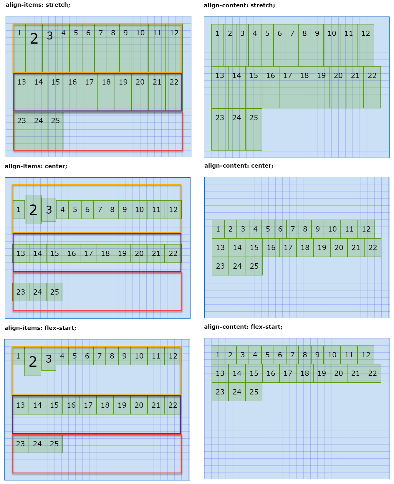
# Exercise
- Try to predict what happens when you set (in the previous example):
flex-flow: column wrap;flex-flow: column wrap;andjustify-content: center;flex-flow: column wrap;andjustify-content: space-evenly;- ...
# Examples
- For our first examples, we don't need any of the flex related properties on the flex item
# Perfectly centered text
- Set the parent element (
article) as a flex container - Set the
heightof the flex container to 100% of the viewport height - Center the text on the main axis and on the cross axis
article {
    display: flex;
    height: 100vh;
    justify-content: center;
    align-items: center;
    background-image: linear-gradient(to bottom, #cbe25f, #7e8627);
}
2
3
4
5
6
7
This is an alternative for the line-height:100% that we've seen earlier in the course. Using flexbox has the added advantage that you can center every element (div, p, ...) instead of just one line of text.
<article>
    <section>This is perfectly centred text</section>
</article>
@import url('https://fonts.googleapis.com/css2?family=Oswald:wght@700&display=swap');

* {
    padding: 0;
    margin: 0;
    box-sizing: border-box;
}

html {
    font-size: 16px;
}

body {
    font-family: 'Oswald', sans-serif;
    line-height: 1.5;
}

article {
    display: flex;
    height: 100vh;
    justify-content: center;
    align-items: center;
    background-image: linear-gradient(to bottom, #cbe25f, #7e8627);
}

section {
    padding: 1rem;
    font-size: 2rem;
}
# Perfectly centered, responsive image
- The
figureelement has exactly the same flexbox properties as thearticlein the previous example
figure {
    display: flex;
    height: 100vh;
    justify-content: center;
    align-items: center;
    background: linear-gradient(to bottom right, #5A98BF, white);
}
2
3
4
5
6
7
- To ensure that the image always falls within the viewport in both landscape mode and portrait mode, we set the
heightof the image to 80% of the SMALLEST dimension of the viewport (height: 80vmin)- More info about
vmincan be found here: Understanding vMin and vMax in CSS
- More info about
img {
    height: 80vmin;
    border: 1px solid #000;
    box-shadow: 0 0 20px rgba(0, 0, 0, .6);
}
2
3
4
5
<figure>
  <img src="https://picsum.photos/id/106/400/600" alt="Flowers">
</figure>
* {
    padding: 0;
    margin: 0;
    box-sizing: border-box;
}

figure {
    display: flex;
    height: 100vh;
    justify-content: center;
    align-items: center;
    background: linear-gradient(to bottom right, #5A98BF, white);
}

img {
    height: 80vmin;
    border: 1px solid #000;
    box-shadow: 0 0 20px rgba(0, 0, 0, .6);
}
# Flex item (child)
# align-self (cross axis)
align-selfcan be used to overwrite the globalalign-itemsproperty for a specific item element
| EMMET instruction | result | description |
|---|---|---|
as:s + TAB | align-self: stretch; | item is stretched inside its flex line on the cross axis |
as:fs + TAB | align-self: flex-start; | item is placed towards the start of its flex line on the cross axis |
as:fe + TAB | align-self: flex-end; | item is placed towards the end of its flex line on the cross axis |
as:c + TAB | align-self: center; | item is placed around the center of its flex line on the cross axis |
as:b + TAB | align-self: baseline; | item is placed on the font baseline inside its flex line on the cross axis |
- In the example below:
- The default alignment on the cross axis is
flex-start
.parent {
  height: 20rem;
  display: flex;
  flex-flow: row wrap;
  justify-content: space-around;
  align-items: flex-start;
  ...
}
1
2
3
4
5
6
7
8- The second and the tenth item are centered on the cross axis
.child:nth-child(2),
.child:nth-child(10) {
    align-self: center;
    background-color: rgba(153, 47, 0, 0.2);
}
1
2
3
4
5- The third, seventh and last item are pushed to the end on the cross axis
.child:nth-child(3),
.child:nth-child(7),
.child:last-child {
    align-self: flex-end;
    background-color: rgba(88, 0, 153, 0.2);
}
1
2
3
4
5
6 - The default alignment on the cross axis is
<h1>align-self</h1>
<div class="parent baseline">
    <div class="child">1</div>
    <div class="child">2</div>
    <div class="child">3</div>
    <div class="child">4</div>
    <div class="child">5</div>
    <div class="child">6</div>
    <div class="child">7</div>
    <div class="child">8</div>
    <div class="child">9</div>
    <div class="child">10</div>
    <div class="child">11</div>
    <div class="child">12</div>
    <div class="child">13</div>
    <div class="child">14</div>
    <div class="child">15</div>
    <div class="child">16</div>
    <div class="child">17</div>
    <div class="child">18</div>
    <div class="child">19</div>
    <div class="child">20</div>
</div>
* {
    padding: 0;
    margin: 0;
    box-sizing: border-box;
}

html {
    font-size: 16px;
}

body {
    font-family: Verdana, Geneva, sans-serif;
    line-height: 1.5;
}

h1 {
    font-size: 1rem;
    margin: 1rem;
}

.parent {
    height: 20rem;
    display: flex;
    flex-flow: row wrap;
    justify-content: space-around;
    align-items: flex-start;
    padding: 1rem;
    margin: 1rem;
    border: 1px solid #0066CC;
    background-color: rgba(0, 102, 204, 0.2);
}

.child {
    padding: .5rem;
    border: 1px solid #4D9900;
    background-color: rgba(77, 153, 0, 0.2);
}

.child:nth-child(2),
.child:nth-child(10) {
    align-self: center;
    background-color: rgba(153, 47, 0, 0.2);
}

.child:nth-child(3),
.child:nth-child(7),
.child:last-child {
    align-self: flex-end;
    background-color: rgba(88, 0, 153, 0.2);
}
# order (main axis)
- By default, every item is ordered according to the position in the DOM and has an
ordervalue of0 - You can change the individual order of each item by giving the
orderproperty a positive or negative value
| EMMET instruction | result |
|---|---|
ord + TAB | order: ; |
- In the example below:
- The default
orderon the main-axis is0 - The second and the tenth item have an order number of
-1
.child:nth-child(2),
.child:nth-child(10) {
    order: -1;
    background-color: rgba(153, 47, 0, 0.2);
}
1
2
3
4
5- The third and the last item have an order number of
1
.child:nth-child(3),
.child:last-child {
    order: 1;
    background-color: rgba(88, 0, 153, 0.2);
}
1
2
3
4
5- The fifth item has an order number of
2
.child:nth-child(5) {
  order: 2;
  background-color: rgba(0, 30, 153, 0.2);
}
1
2
3
4 - The default
<h1>order</h1>
<div class="parent baseline">
    <div class="child">1</div>
    <div class="child">2</div>
    <div class="child">3</div>
    <div class="child">4</div>
    <div class="child">5</div>
    <div class="child">6</div>
    <div class="child">7</div>
    <div class="child">8</div>
    <div class="child">9</div>
    <div class="child">10</div>
    <div class="child">11</div>
    <div class="child">12</div>
    <div class="child">13</div>
    <div class="child">14</div>
    <div class="child">15</div>
    <div class="child">16</div>
    <div class="child">17</div>
    <div class="child">18</div>
    <div class="child">19</div>
    <div class="child">20</div>
</div>
* {
    padding: 0;
    margin: 0;
    box-sizing: border-box;
}

html {
    font-size: 16px;
}

body {
    font-family: Verdana, Geneva, sans-serif;
    line-height: 1.5;
}

h1 {
    font-size: 1rem;
    margin: 1rem;
}

.parent {
    height: 20rem;
    display: flex;
    flex-flow: row wrap;
    align-items: flex-start;
    padding: 1rem;
    margin: 1rem;
    border: 1px solid #0066CC;
    background-color: rgba(0, 102, 204, 0.2);
}

.child {
    padding: .5rem;
    border: 1px solid #4D9900;
    background-color: rgba(77, 153, 0, 0.2);
}

.child:nth-child(2),
.child:nth-child(10) {
    order: -1;
    background-color: rgba(153, 47, 0, 0.2);
}

.child:nth-child(3),
.child:last-child {
    order: 1;
    background-color: rgba(88, 0, 153, 0.2);
}

.child:nth-child(5) {
    order: 2;
    background-color: rgba(0, 30, 153, 0.2);
}
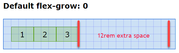
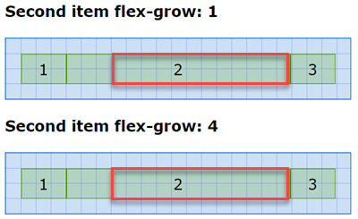
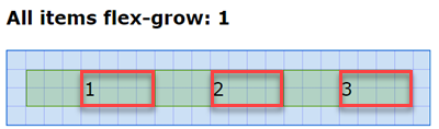
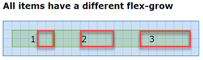
# flex-grow (main axis)
- In the example below, all flex items have a fixed
widthof3rem - Even if there is more space than 9rem (three items of 3rem) in the flex container, the items will not be wider than their original size
- You can adjust this behavior via the
flex-growproperty
- You can adjust this behavior via the
- Every item has a default value of
flex-grow: 0
- If you specify exactly one item with a value greater than 0, this item will take up all the remaining width
- If you specify all items with the same value, but greater than 0, all items get an equal share of the remaining width
- If you specify different values for every item, you can calculate the share of each item
- The first item has
flex-grow: 2, the second itemflex-grow: 4and the last itemflex-grow: 6 - This is a total of
2 + 4 + 6 = 12 - The first item get 2/12 of the remaining space, the second item gets 4/12 and the last item 6/12
- The first item has
<h1>Default flex-grow: 0</h1>
<div class="parent">
    <div class="child">1</div>
    <div class="child">2</div>
    <div class="child">3</div>
</div>
<h1>Second item flex-grow: 1</h1>
<div class="parent">
    <div class="child">1</div>
    <div class="child grow_1">2</div>
    <div class="child">3</div>
</div>
<h1>Second item flex-grow: 4</h1>
<div class="parent">
    <div class="child">1</div>
    <div class="child grow_4">2</div>
    <div class="child">3</div>
</div>
<h1>All items flex-grow: 1</h1>
<div class="parent">
    <div class="child grow_1">1</div>
    <div class="child grow_1">2</div>
    <div class="child grow_1">3</div>
</div>
<h1>All items have a different flex-grow</h1>
<div class="parent">
    <div class="child grow_2">1</div>
    <div class="child grow_4">2</div>
    <div class="child grow_6">3</div>
</div>
* {
    padding: 0;
    margin: 0;
    box-sizing: border-box;
}

html {
    font-size: 16px;
}

body {
    font-family: Verdana, Geneva, sans-serif;
    line-height: 1.5;
}

h1 {
    font-size: 1rem;
    margin: 1rem;
}

.parent {
    width: 23rem;
    display: flex;
    padding: 1rem;
    margin: 1rem;
    border: 1px solid #0066CC;
    background-color: rgba(0, 102, 204, 0.2);
    background-size: 1rem 1rem;
    background-image:
        linear-gradient(rgba(0, 0, 255, .3), transparent 1px),
        linear-gradient(90deg, rgba(0, 0, 255, .3), transparent 1px);
}

.child {
    width: 3rem;
    height: 2rem;
    text-align: center;
    line-height: 1;
    padding: .5rem;
    border: 1px solid #4D9900;
    background-color: rgba(77, 153, 0, 0.2);
}

.grow_1 {
    flex-grow: 1;
}

.grow_2 {
    flex-grow: 2;
}

.grow_4 {
    flex-grow: 4;
}

.grow_6 {
    flex-grow: 6;
}
| EMMET instruction | result |
|---|---|
fxg + TAB | flex-grow: ; |
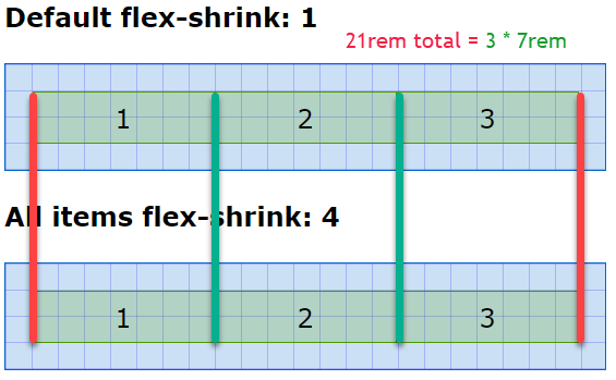
# flex-shrink (single line - main axis)
- In the example below, all flex items have a fixed
widthof10remand the flex container has amax-widthof23rem(minus the padding is21remfor the content) - If there is not enough space for the flex items to fit in the flex container, the flex items will all shrink at the same rate by default
- You can adjust this behavior via the
flex-shrinkproperty
- You can adjust this behavior via the
- Every item has a default value of
flex-shrink: 1 - So,
21rem / 3items is7remper item- Note that you get the same result when you give all flex items the same
flex-shrinkvalue!
- Note that you get the same result when you give all flex items the same
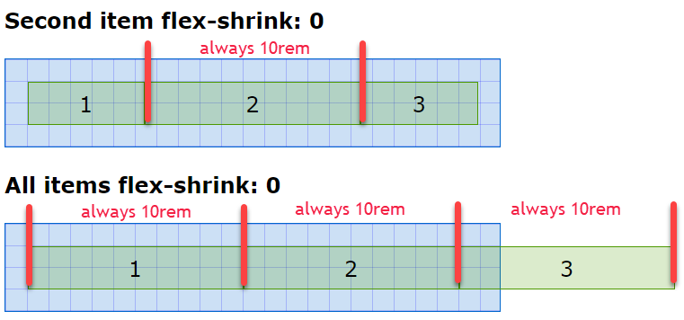
- If you specify one or more items with a value of 0, these items will not shrink
- You can also specify different values for every item
- The first item has
flex-shrink: 2, the second itemflex-shrink: 4and the last itemflex-shrink: 6 - The second item shrinks (4/2=) two times faster then the first item
- The third item shrinks (6/2=) three times faster then the first item
- The first item has

<h1>Default flex-shrink: 1</h1>
<div class="parent">
    <div class="child">1</div>
    <div class="child">2</div>
    <div class="child">3</div>
</div>
<h1>All items flex-shrink: 4</h1>
<div class="parent">
    <div class="child shrink_4">1</div>
    <div class="child shrink_4">2</div>
    <div class="child shrink_4">3</div>
</div>
<h1>Second item flex-shrink: 0</h1>
<div class="parent">
    <div class="child">1</div>
    <div class="child shrink_0">2</div>
    <div class="child">3</div>
</div>
<h1>All items flex-shrink: 0</h1>
<div class="parent">
    <div class="child shrink_0">1</div>
    <div class="child shrink_0">2</div>
    <div class="child shrink_0">3</div>
</div>
<h1>All items have a different flex-shrink</h1>
<div class="parent">
    <div class="child shrink_2">1</div>
    <div class="child shrink_4">2</div>
    <div class="child shrink_6">3</div>
</div>
* {
    padding: 0;
    margin: 0;
    box-sizing: border-box;
}

html {
    font-size: 16px;
}

body {
    font-family: Verdana, Geneva, sans-serif;
    line-height: 1.5;
}

h1 {
    font-size: 1rem;
    margin: 1rem;
}

.parent {
    max-width: 23rem;
    display: flex;
    /* flex-wrap: wrap; */
    padding: 1rem;
    margin: 1rem;
    border: 1px solid #0066CC;
    background-color: rgba(0, 102, 204, 0.2);
    background-size: 1rem 1rem;
    background-image:
        linear-gradient(rgba(0, 0, 255, .3), transparent 1px),
        linear-gradient(90deg, rgba(0, 0, 255, .3), transparent 1px);
}

.child {
    width: 10rem;
    height: 2rem;
    text-align: center;
    line-height: 1;
    padding: .5rem;
    border: 1px solid #4D9900;
    background-color: rgba(77, 153, 0, 0.2);
}

.shrink_0 {
    flex-shrink: 0;
}

.shrink_2 {
    flex-shrink: 2;
}

.shrink_4 {
    flex-shrink: 4;
}

.shrink_6 {
    flex-shrink: 6;
}
| EMMET instruction | result |
|---|---|
fxsh + TAB | flex-shrink: ; |
REMARK
flex-shrinkhas no effect with the settingflex-wrap: wrap;on the flex container because then a new row is automatically created if there is not enough room for the items- Look what happens when setting
flex-wrap: wrap;in the example above - All flex items expand to their original
widthof10rem
- Look what happens when setting
.parent {
    max-width: 23rem;
    display: flex;
    flex-wrap: wrap;
    ...
}
2
3
4
5
6
# flex-basis (main axis)
- The
flex-basisproperty sets the initial size of a flex item on the main axis - The default value for
flex-basisisauto - If the normal size (
widthorheight, depending on the direction) is also set, then aflex-basisproperty other thanautowill overwrite these settings- If
flex-direction: rowthenflex-basisoverwrites thewidthproperty - If
flex-direction: columnthenflex-basisoverwrites theheightproperty
- If
- The properties
min-width,max-width,min-heightandmax-heightcan still be used and are not effected byflex-basis
<h1>Default flex-basis: auto</h1>
<div class="parent">
    <div class="child">1</div>
    <div class="child">2</div>
    <div class="child">3</div>
</div>
<h1>All items a different flex-basis</h1>
<div class="parent">
    <div class="child">1</div>
    <div class="child basis_5">2</div>
    <div class="child basis_10">3</div>
</div>
* {
    padding: 0;
    margin: 0;
    box-sizing: border-box;
}

html {
    font-size: 16px;
}

body {
    font-family: Verdana, Geneva, sans-serif;
    line-height: 1.5;
}

h1 {
    font-size: 1rem;
    margin: 1rem;
}

.parent {
    display: flex;
    /* flex-direction: column;*/
    padding: 1rem;
    margin: 1rem;
    border: 1px solid #0066CC;
    background-color: rgba(0, 102, 204, 0.2);
    background-size: 1rem 1rem;
    background-image:
        linear-gradient(rgba(0, 0, 255, .3), transparent 1px),
        linear-gradient(90deg, rgba(0, 0, 255, .3), transparent 1px);
}

.child {
    width: 3rem;
    height: 3rem;
    text-align: center;
    line-height: 1;
    padding: .5rem;
    border: 1px solid #4D9900;
    background-color: rgba(77, 153, 0, 0.2);
}

.basis_5 {
    flex-basis: 5rem;
}

.basis_10 {
    flex-basis: 10rem;
}
- In the first example, all flex items have only a
widthand aheightof3rem - In the second example, all flex items have also a
widthand aheightof3rem- the second item has a
flex-basisof5remand overwriteswidth: 3rem; - the third item has a
flex-basisof10remand overwriteswidth: 3rem;
- the second item has a
Example with flex-basis of 100% 
Example with only the second div a flex-basis of 100% 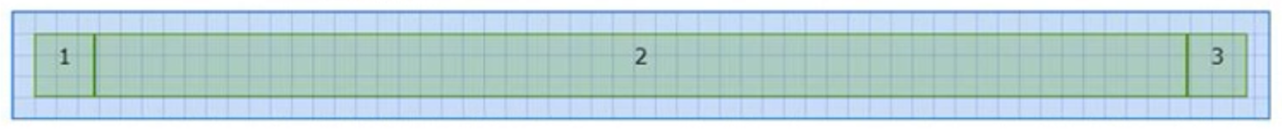
# Exercise
- Change the
flex-directionof the flex container tocolumnand see how theflex-basisproperty now overwrites theheightproperty instead of thewidthproperty
| EMMET instruction | result |
|---|---|
fxb + TAB | flex-basis: ; |
# flex (shorthand)
- Flex is just a shorthand for
flex-grow, followed byflex-shrinkandflex-basis - Some (common) examples:
| flex | flex-grow | flex-shrink | flex-basis |
|---|---|---|---|
flex: 1 1 auto; | 1 | 1 (default) | auto (default) |
flex: 0 1 3rem; | 0 (default) | 1 (default) | 3rem |
TIP
- To avoid confusion, we advice to specify a value for all the properties (
flex-grow,flex-shrinkandflex-basis) involved. As such, it's convenient to know the default values of these properties (flex-grow: 0;,flex-shrink: 1;,flex-basis: auto;) by heart!- For those interested, the one-value or two-value syntax is explained on the MDN web docs flex page
| EMMET instruction | result |
|---|---|
fx + TAB | flex: ; |
# Examples
# Basic navbar
- A basic navbar (without styling) requires only 5 lines of flex related properties
- Just for demonstrating purposes, all relevant elements have an
outline(ulis blue,liis green andais red)
<nav>
    <ul>
        <li><a href="">link 1</a></li>
        <li><a href="">link 2</a></li>
        <li><a href="">link 3</a></li>
        <li><a href="">link 4</a></li>
        <li><a href="">link 5</a></li>
    </ul>
</nav>
* {
    padding: 0;
    margin: 0;
    box-sizing: border-box;
}

html {
    font-size: 16px;
}

body {
    font-family: Verdana, Geneva, sans-serif;
    line-height: 1.5;
}

nav {
    padding: 1rem;
}

nav ul {
    /* display: flex;
    list-style-type: none; */
    outline: 1px solid #0066CC;
}

nav li {
    /* flex: 1 1 auto; */
    /* display: flex; */
    outline: 1px solid #4D9900;
    outline-offset: -2px;
}

nav a {
    /* flex: 1 1 auto; */
    outline: 1px solid #CC4B00;
    outline-offset: -4px;
}
- Transform the unordered list to a flexbox and remove the bullets from the unordered list
nav ul {
    display: flex;
    list-style-type: none;
    outline: 1px solid #0066CC;
}
2
3
4
5

2. Spread all list items equally along the main axis
nav li {
    flex: 1 1 auto;
    /* display: flex; */
    outline: 1px solid #7600cc;
    outline-offset: -2px;
}
2
3
4
5
6

3. Make every list item a flex container and spread its child element (the anchor tag a) to its full width, such that it looks like the whole list item is clickable
nav li {
    flex: 1 1 auto;
    display: flex;
    outline: 1px solid #7600cc;
    outline-offset: -2px;
}
nav a {
    flex: 1 1 auto;
    outline: 1px solid #cc4b00;
    outline-offset: -4px;
}
2
3
4
5
6
7
8
9
10
11

# Responsive navbar with styling
<nav>
<ul>
<li>
<a href="#!">
<i class="fas fa-home"></i>
<span>Home</span>
</a>
</li>
<li class="qa">
<a href="#!">
<i class="fas fa-question-circle"></i>
<span>Q&A</span>
</a>
</li>
<li class="spacer"></li>
<li>
<a href="#!">
<i class="fab fa-twitter"></i>
<span>Twitter</span>
</a>
</li>
<li>
<a href="#!">
<i class="fab fa-instagram"></i>
<span>Instagram</span>
</a>
</li>
<li>
<a href="#!">
<i class="fab fa-facebook-f"></i>
<span>Facebook</span>
</a>
</li>
<li>
<a href="#!">
<i class="fab fa-slack"></i>
<span>Slack</span>
</a>
</li>
<li class="spacer"></li>
</ul>
</nav>
<main>
<p>Lorem ipsum dolor sit amet, consectetur adipisicing elit. Nesciunt cumque quod, nam iste ab inventore ratione. Mollitia, ex, explicabo! Temporibus iste illo necessitatibus neque hic quidem doloremque asperiores ullam officia!</p>
<p>Inventore, fugiat, aperiam! Dicta nemo ad sapiente. Voluptas nihil, iste perspiciatis a voluptatum facere quibusdam molestiae repudiandae amet impedit unde et consectetur, fuga commodi, recusandae sed porro repellat animi enim.</p>
<p>Laborum commodi ipsam expedita, quia, non fuga omnis laudantium animi quaerat tenetur aspernatur, ratione iste placeat id nihil numquam enim necessitatibus fugiat eius. Dolore, repellendus doloribus id repellat temporibus natus.</p>
<p>Dignissimos dolores reiciendis aspernatur nisi illo suscipit. Nam suscipit minima quisquam est quam earum fugiat voluptates error nostrum, minus beatae nemo qui adipisci, eos accusamus laboriosam recusandae, a odit mollitia!</p>
<p>Voluptatem nemo mollitia accusantium itaque explicabo tempore, quos, dicta voluptatibus eaque dolorum non quisquam quae sapiente facilis velit est beatae vitae porro molestias? Nulla animi commodi reiciendis, iusto laudantium quam.</p>
</main>
@import url('https://fonts.googleapis.com/css2?family=Montserrat:wght@400,500&display=swap');
@import url('https://cdnjs.cloudflare.com/ajax/libs/font-awesome/5.15.1/css/all.min.css');

* {
    padding: 0;
    margin: 0;
    box-sizing: border-box;
}

html {
    font-size: 16px;
}

body {
    font-family: 'Montserrat', sans-serif;
    line-height: 1.5;
}

nav {
    font-weight: 500;
    background-color: #fff;
}

nav ul {
    display: flex;
    flex-direction: column;
    list-style-type: none;
    border-top: 1px solid #c03d1e;
}

nav li {
    display: flex;
    background-color: #f04c25;
    border-bottom: 1px solid #c03d1e;
}

nav a {
    flex: 1 1 auto;
    line-height: 2;
    text-decoration: none;
    color: #fff;
}

nav a:hover {
    background-color: #c03d1e;
}

nav a i {
    margin: 0 .5rem;
}

nav li.spacer {
    display: none;
}

main {
    max-width: 800px;
    margin: 1rem auto;
}

main p {
    margin: 1rem;
}

@media screen and (min-width: 400px) {
    nav ul {
        flex-direction: row;
    }

    nav li {
        flex: 1 1 auto;
    }

    nav a {
        text-align: center;
    }

    nav a span {
        display: none;
    }

    .qa {
        order: 1;
    }

}

@media screen and (min-width: 600px) {
    nav li.spacer {
        display: block;
        flex: 2 1 auto;
    }
}

@media screen and (min-width: 800px) {
    nav li.spacer {
        display: none;
    }

    nav a span {
        display: inline;
    }
}
- Screen size < 400px
- Show all list items in a
column - The two
li.spacerelements are not visible
nav ul {
   display: flex;
   flex-direction: column;
   ...
}
nav li {
   display: flex;
   ...
}
nav a {
   flex: 1 1 auto;
   ...
}
nav li.spacer {
   display: none;
}
1
2
3
4
5
6
7
8
9
10
11
12
13
14
15
16 - Show all list items in a
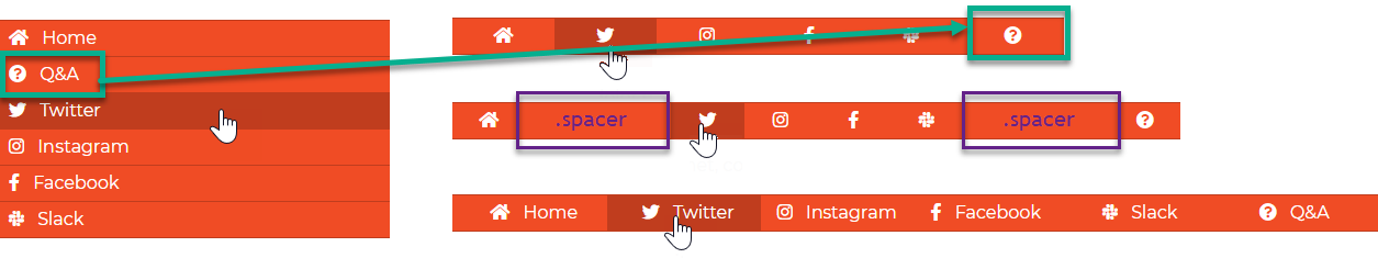
- Screen size >= 400px and < 600px
- Switch the orientation of the list items from
columntorow - Each list item must grow with the same amount so that they are equally distributed along the entire width
- The content inside every anchor tag
ais horizontally centered - Only the icon inside the anchor tag
ais visible, the text is hidden - The link Q&A is moved to the far right of the navbar
- The two
li.spacerelements are (still) not visible
@media screen and (min-width: 400px) {
    nav ul {
        flex-direction: row;
    }
    nav li {
        flex: 1 1 auto;
    }
    nav a {
        text-align: center;
    }
    nav a span {
        display: none;
    }
    .qa {
        order: 1;
    }
}
1
2
3
4
5
6
7
8
9
10
11
12
13
14
15
16
17 - Switch the orientation of the list items from
- Screen size >= 600px and < 800px
- Make the two
li.spacervisible and let them grow twice as fast as the other list items
@media screen and (min-width: 600px) {
    nav li.spacer {
        display: block;
        flex: 2 1 auto;
    }
}
1
2
3
4
5
6 - Make the two
- Screen size >= 800px
- Hide the two
li.spacerelements again - Show the text on the right side of every icon
@media screen and (min-width: 800px) {
    nav li.spacer {
        display: none;
    }
    nav a span {
        display: inline;
    }
}
1
2
3
4
5
6
7
8 - Hide the two
REMARK
In this example, we use Font Awesome icons, which will be discussed in detail in the follow-up course Webdesign advanced. For now, it suffices to know that
- you have to import the icon library by using an
@importstatement in your CSS-file, just as we did for Google fonts:@import url('https://cdnjs.cloudflare.com/ajax/libs/font-awesome/5.15.1/css/all.min.css'); - you can use the 1609 free icons by putting them in an
i-tag in your HTML file:<i class="fas fa-home"></i>
# Full page layout
<div class="container">
    <header>Header</header>
    <main>
        <nav>Nav</nav>
        <section>Section</section>
        <aside>Aside</aside>
    </main>
    <footer>Footer</footer>
</div>
@import url('https://fonts.googleapis.com/css2?family=Anton&display=swap');

* {
    padding: 0;
    margin: 0;
    box-sizing: border-box;
}

html {
    font-size: 16px;
}

body {
    font-family: 'Anton', sans-serif;
    line-height: 1.5;
}

.container {
    padding: 1rem;
    max-width: 900px;
    margin: 1rem auto;
}

header, nav, section, aside, footer {
    border: 1px solid #000;
    padding: 1rem;
    text-align: center;
    margin-bottom: 1rem;
}

section {
    min-height: 40vh;
}

main {
    display: flex;
    flex-direction: column;
}

@media screen and (min-width: 600px) {
    main {
        flex-direction: row;
    }

    nav, aside {
        flex: 0 1 150px;
    }

    section {
        flex: 1 1 auto;
        margin-left: 1rem;
        margin-right: 1rem;
    }
}
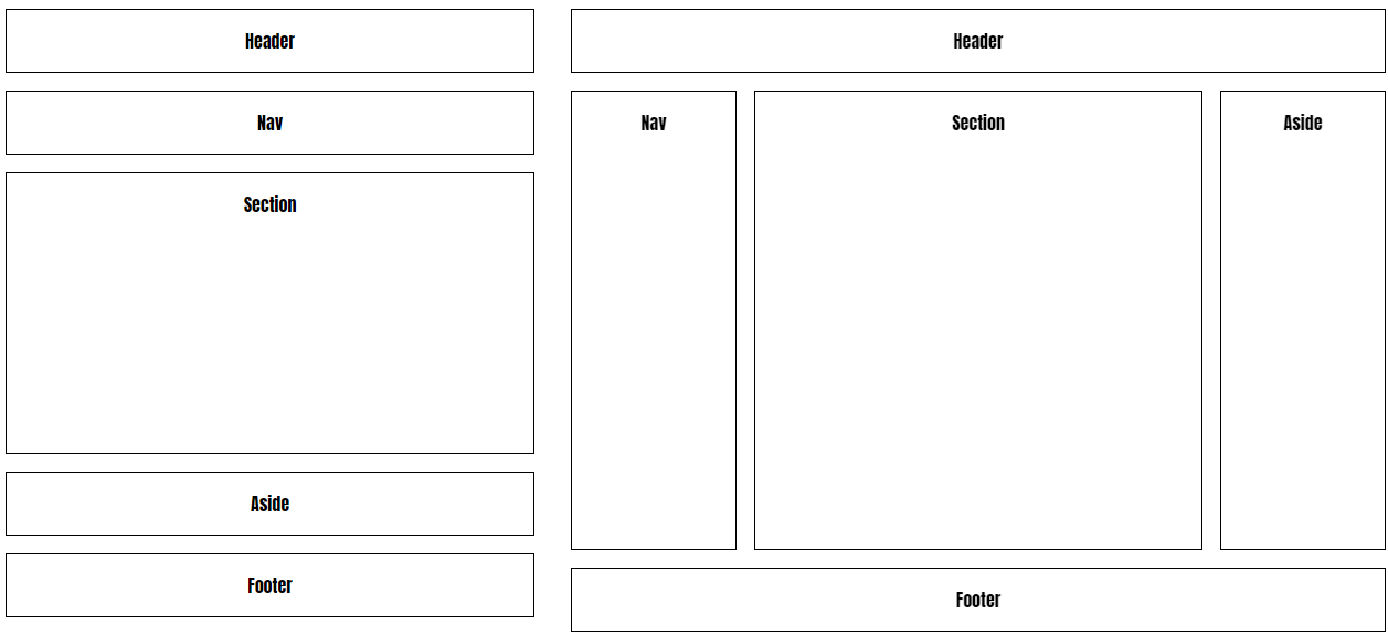
- All the flex magic happens inside the
maincontainer - Small screen
nav,sectionandasideare positioned below each other
main {
    display: flex;
    flex-direction: column;
}
2
3
4
- Large screen
nav,sectionandasideare positioned next to each othernavandasidehave a fixedwidthof150px- The
sectiontakes the rest of the space with a left and rightmarginof1rem
@media screen and (min-width: 600px) {
    main {
        flex-direction: row;
    }
    nav, aside {
        flex: 0 1 150px;
    }
    section {
        flex: 1 1 auto;
        margin-left: 1rem;
        margin-right: 1rem;
    }
}
2
3
4
5
6
7
8
9
10
11
12
13
# Dices
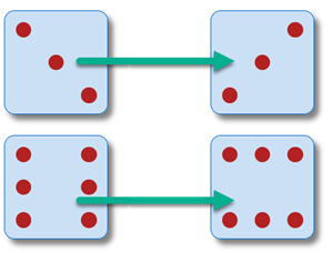
- Try to understand how these dices are constructed
- In this example, we have chosen not to fully optimise the code, but to code the flexbox properties per dice
<div id="groupDices">
    <div id="dice1" class="dice">
        <span></span>
    </div>
    <div id="dice2" class="dice">
        <span></span>
        <span></span>
    </div>
    <div id="dice3" class="dice">
        <span></span>
        <span></span>
        <span></span>
    </div>
    <div id="dice4" class="dice">
        <div>
            <span></span>
            <span></span>
        </div>
        <div>
            <span></span>
            <span></span>
        </div>
    </div>
    <div id="dice5" class="dice">
        <div>
            <span></span>
            <span></span>
        </div>
        <div>
            <span></span>
        </div>
        <div>
            <span></span>
            <span></span>
        </div>
    </div>
    <div id="dice6" class="dice">
        <div>
            <span></span>
            <span></span>
            <span></span>
        </div>
        <div>
            <span></span>
            <span></span>
            <span></span>
        </div>
    </div>
</div>
* {
    padding: 0;
    margin: 0;
    box-sizing: border-box;
}

#groupDices {
    display: flex;
    flex-flow: row wrap;
}

.dice {
    width: 100px;
    height: 100px;
    padding: 10px;
    margin: 10px;
    border: 1px solid #0066CC;
    border-radius: 10px;
    background-color: rgba(0, 102, 204, 0.2);
    box-shadow: 5px 5px 5px rgba(0, 0, 0, .5);
}

span {
    width: 15px;
    height: 15px;
    background-color: firebrick;
    border-radius: 50%;
}

/* dice 1 */
#dice1 {
    display: flex;
    justify-content: center;
    align-items: center;
}

/* dice 2 */
#dice2 {
    display: flex;
    justify-content: space-between;
}
#dice2 span:last-child {
    align-self: flex-end;
}

/* dice 3 */
#dice3 {
    display: flex;
    justify-content: space-between;
    align-items: flex-start;
}
#dice3 span:nth-child(2) {
    align-self: center;
}
#dice3 span:last-child {
    align-self: flex-end;
}

/* dice 4 */
#dice4 {
    display: flex;
    justify-content: space-between;
}
#dice4 div {
    display: flex;
    flex-direction: column;
    justify-content: space-between;
    /* outline: 2px solid rgba(187, 0, 255, 0.5); */
}

/* dice 5 */
#dice5 {
    display: flex;
    justify-content: space-between;
}
#dice5 div {
    display: flex;
    flex-direction: column;
    justify-content: space-between;
    /* outline: 2px solid rgba(187, 0, 255, 0.5); */
}
#dice5 div:nth-child(2) {
    justify-content: center;
}

/* dice 6 */
#dice6 {
    display: flex;
    justify-content: space-between;
}
#dice6 div {
    display: flex;
    flex-direction: column;
    justify-content: space-between;
    /* outline: 2px solid rgba(187, 0, 255, 0.5); */
}
- A little exercise: change the orientation of dice 3 and dice 6
# Links
- Interactive Guide to Flexbox
- Flexbox Froggy Game
- Flexbox Playground @ loading.io
- Flexbox Playground @ scotch.io
- Flexbox Playground @ flexbox.tech
READING TIP