# (Bootstrap) Grid
# General info on grid systems
# Using grid systems
- Working with grid systems allows you to use pre-made components so you can build your site faster (and cheaper)
- Grid systems are a useful foundation if you need to create a site in which working in columns is necessary
- By using a grid system you can quickly achieve the desired outcome by applying the correct class names
- When using grid systems, you should use the existing class names and write as little CSS as possible
- You can compare a grid system with an easy building kit
- Use the accompanying instructions and follow the guidelines implemented by the system
- If you don’t do this, your end result will become unstable or unusable
WARNINGS
- Never change any CSS-code in the original grid system’s files, as this would make it impossible to easily update your version (when there is an update available by the creator of the grid system)
- If you need to apply your own code to change the behavior, add it after the CSS-import of the grid system
# Grid?
- The term grid refers points to the use of a raster on which you can lay-out your elements
- Most of the available systems use a grid system based on a division of 12ths
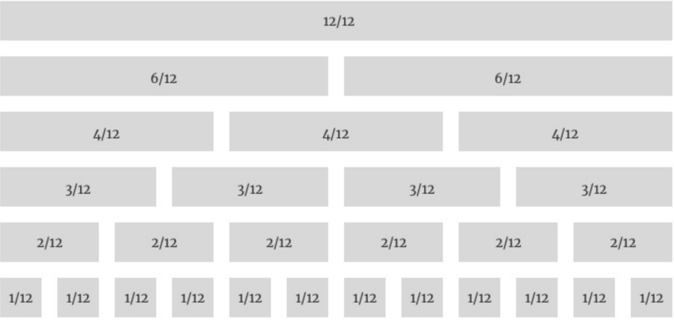
- When using this approach, you’ll be able to design most of the websites and lay-outs you need
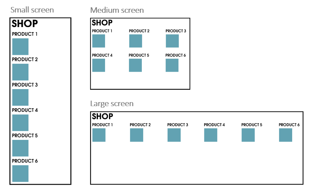
# Example
- When using a small screen, like a smartphone, you can display all elements with a width of 12 so they are “full” width
- On a medium-sized screen you can opt for using a width of 4, which will result in three columns (12 / 4 = 3)
- If the user has a wide (full HD, 4K) screen, you can use a width of 2 that will result in 6 columns
# Available grid systems
- There are multiple responsive grid systems available
- Large CSS frameworks (such as Materialize, Bootstrap, ...) often include their own grid system
- Examples
# Using Bootstrap grid
- The grid of Bootstrap is based on the CSS flexbox implementation
- Previous versions (<= v3) of Bootstrap did not yet use flexbox, but as of v4 it does, and so do most of the large frameworks that use a grid system
- In the previous chapter you learned to apply
display:flex;on a parent element to display the child elements besides (or beneath) each other- You probably noticed that flexbox makes positioning easier than with the classic
floatandpositionproperties
- You probably noticed that flexbox makes positioning easier than with the classic
REMARK
Bootstrap is a complete CSS framework and as such much more than only a grid implementation, but in this course we will only focus on the grid system of Bootstrap
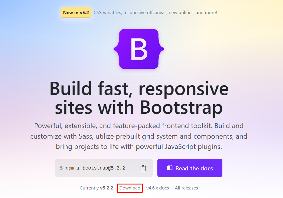
- In order to use the Bootstrap grid in our own application we first need to download the latest STABLE version (v5.2.2) from getbootstrap.com
- Download the Compiled CSS and JS version
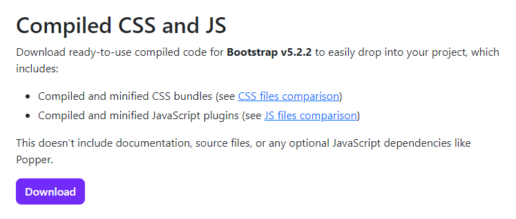
- When unpacking the zip file, you will find two additional folders: css and js
- We will only focus on (some of) the CSS files at this point of time
# bootstrap_grid.css
- Open the file css/bootstrap-grid.css in your code editor
- When examining the file you can see that it is built mobile-first (
@media (min-width: ...px) {...})
TIP
You can use this file as a reference for all the available class names 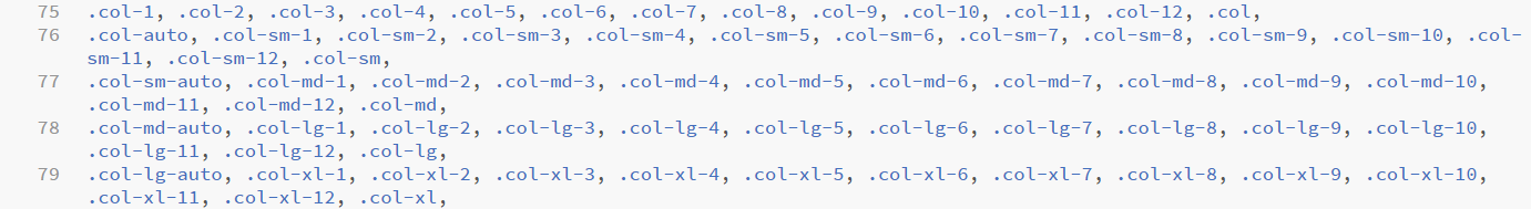
or you can resort to the Bootstrap Grid documentation
- The bootstrap_grid.css file clearly shows the flexbox implementation of Bootstrap
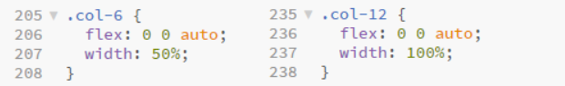
- If you apply a
col-6class to an element it will take up 6 of the available 12 columns, and thus will use 50% of the space available - A
col-12class will display an element at full width, taking up all 12 available columns
- If you apply a
- The most interesting when using the Bootstrap grid system, as opposed to writing the flex implementations yourself, is that you can avoid to write any media queries yourself by applying more specific classes
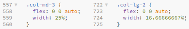
- The additional
-md-means that if you apply this class to an element, it will take up 3 columns of the available 12 when displayed on a medium (or larger) sized display - There are also
-sm-,-lg-and-xl-classes available, which are applied when your screen width exceeds the corresponding breakpoint
- The additional
READING TIP
- All the available widths and their corresponding breakpoints are listed in the table below
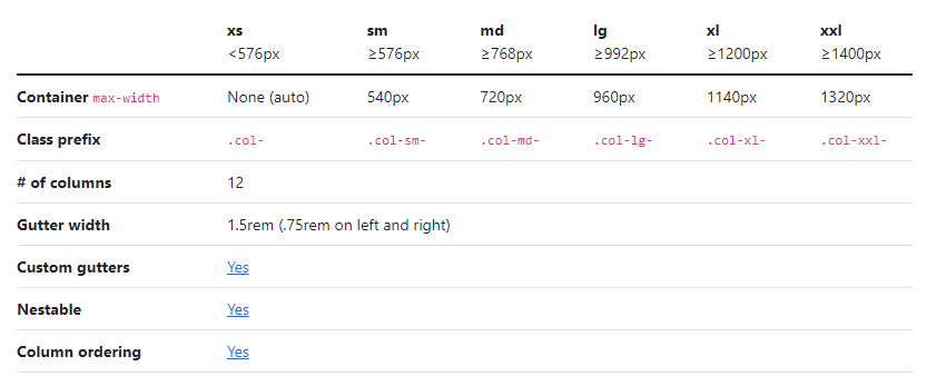
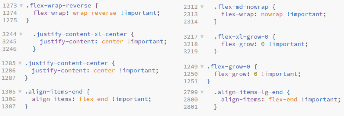
- You can also find the implementation of different flexbox extensions that are related to the different flexbox properties
flex-wrap,flex-grow,justify-content,align-items, …
- Bootstrap grid contains
order-...classes to control the visual order of the content. You can specify- a number between 0 and 12 or
first/last(order-2,order-first, ...) - the screen size from which the reordering should be applied (
order-md-1,order-xl-last, ...)
- a number between 0 and 12 or

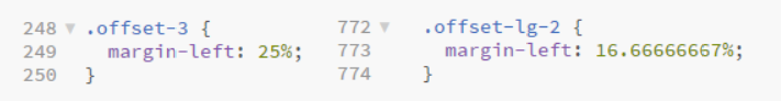
- In addition, you can use the
offset-...classes (and their responsive variants) such asoffset-3,offset-lg-2, ... to move columns to the right
READING TIP
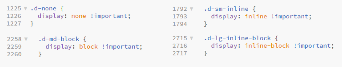
- You can set the value of the
displayproperty by using the classesd-...
READING TIP
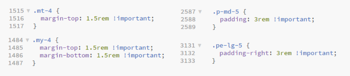
- Finally, we point to the (margin and padding) spacing utility classes to add responsive-friendly margin/padding values to an element. You can specify
- whether you want to set margin (
m-...) or padding (p-...) - the sides of the margin/padding (
ps-...,my-..., ...) - the size ranging from 0 to 5 or
auto(p-3,mt-4,m-auto, ...) - the screen size from which a margin or padding should be applied (
px-lg-1,m-md-5, ...)
- whether you want to set margin (
READING TIP
# bootstrap_reboot.css
- The file css/bootstrap-reboot.css contains the comprehensive universal reset of Bootstrap
- We already include it here, so that you will be familiar with the effects of this reset when we study Bootstrap in full detail later on (in the follow-up course Webdesign Advanced)
- The reset contains
border-sizing: border-boxon every element- default
font-family,line-height,color, ... paddingandmarginfor specific elements (often expressed inremunits)- ...
TIP
Open the file in your code editor for more details or check the Bootstrap Reboot documentation
# Content Delivery Network
- When you want to use the Bootstrap grid (and reboot) in your projects, you can
- host the files bootstrap_grid.css and bootstrap_reboot.css on your webspace and link to them in the correct order (first the reboot, then the grid!)
<link rel="stylesheet" href="bootstrap_reboot.css">
<link rel="stylesheet" href="bootstrap_grid.css">
1
2- link to these files (in the correct order) on a Content Delivery Network such as Cloudflare's cdnjs.com
<link rel="stylesheet" href="https://cdnjs.cloudflare.com/ajax/libs/bootstrap/5.2.2/css/bootstrap-reboot.min.css">
<link rel="stylesheet" href="https://cdnjs.cloudflare.com/ajax/libs/bootstrap/5.2.2/css/bootstrap-grid.min.css">
1
2
# Examples
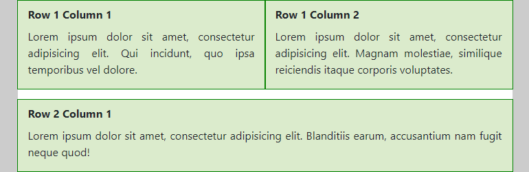
# Example 1: The basics
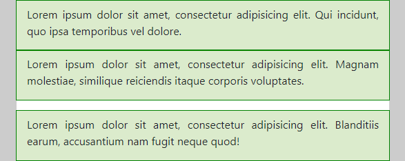
<div class="container mt-3">
    <header class="mb-3">
        <h1>Example 1</h1>
    </header>
    <div class="row mb-3">
        <div class="col pt-2">
            <h2>Row 1 Column 1</h2>
            <p>Lorem ipsum dolor sit amet, consectetur adipisicing elit. Qui incidunt, quo ipsa temporibus vel dolore.</p>
        </div>
        <div class="col pt-2">
            <h2>Row 1 Column 2</h2>
            <p>Lorem ipsum dolor sit amet, consectetur adipisicing elit. Magnam molestiae, similique reiciendis itaque corporis voluptates.</p>
        </div>
    </div>
    <div class="row">
        <div class="col pt-2">
            <h2>Row 2 Column 1</h2>
            <p>Lorem ipsum dolor sit amet, consectetur adipisicing elit. Blanditiis earum, accusantium nam fugit neque quod!</p>
        </div>
    </div>
</div>
body {
    background-color: #ccc;
}

h2 {
    font-size: 1rem;
}

.container {
    background-color: white;
}

.row div {
    background-color: rgba(77, 153, 0, 0.2);
    outline: 1px solid green;
    text-align: justify;
}
- Elements in the Bootstrap grid are divided in three main categories:
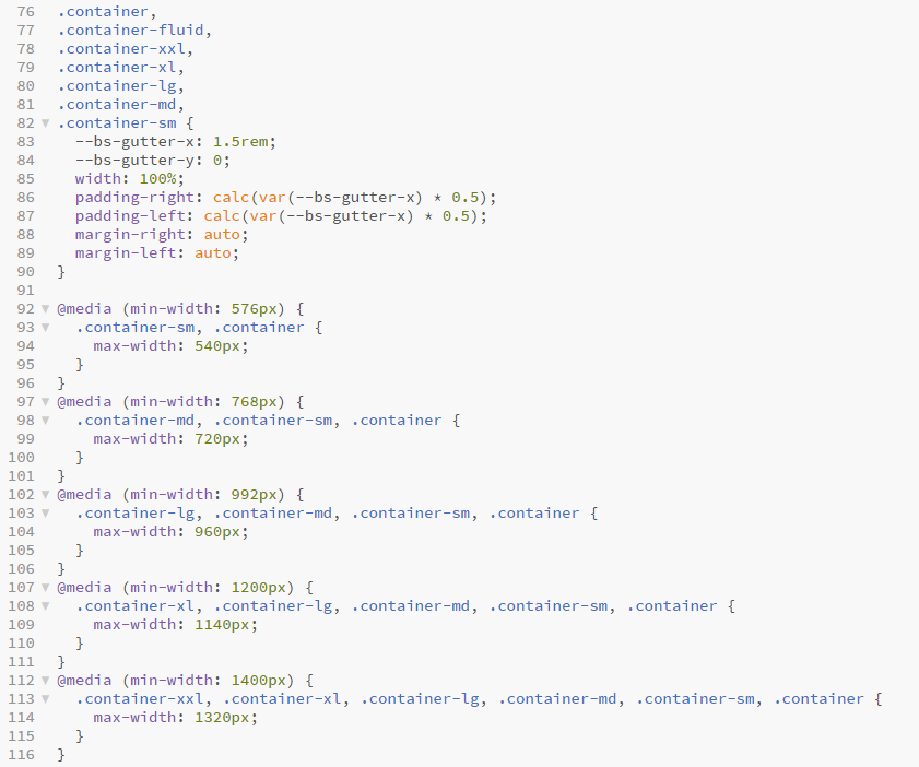
# Container (with a container class)
- The code for the
containerclass in bootstrap_grid.css should be clear- The container with fixed
width: 100%gets a left and right margin that is set toautoand will therefore be centred on the page - The
max-widthof the container depends on the viewport width
- The container with fixed
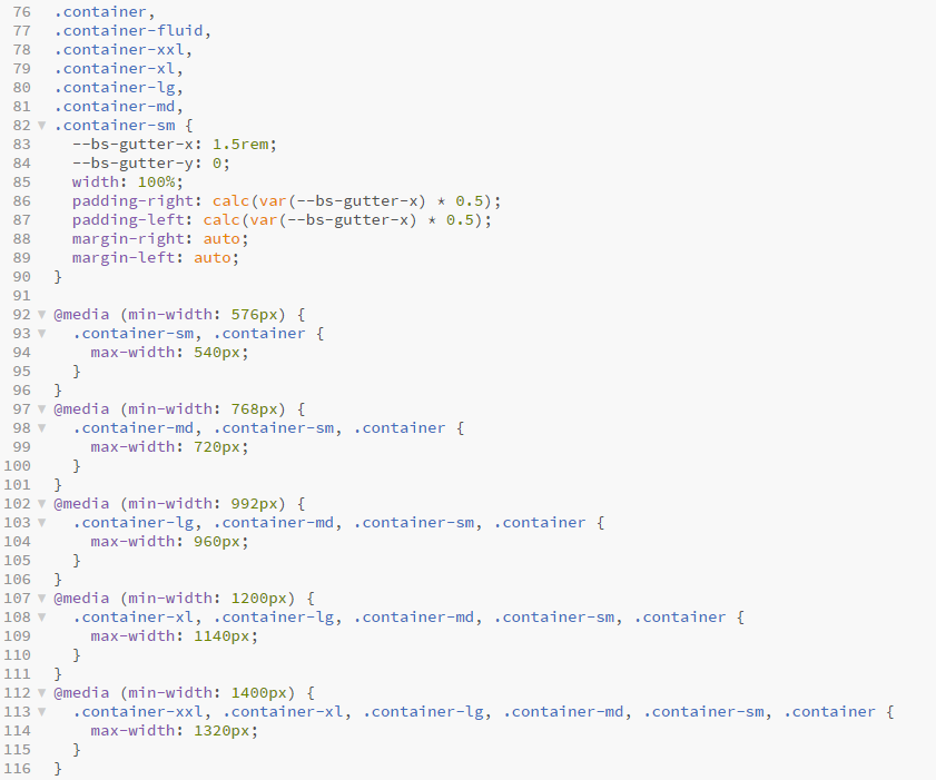
REMARK
You can also use the classes
container-fluidwhich will result in a container that has always awidthof 100%container-sm,container-md,container-lg,container-xlandcontainer-xxl, which will result in a containerwidthof 100% until the specified breakpoint
See also the Bootstrap Containers documentation
- In this example we added
- a grey (
#ccc)background-colorto ourbody, and a whitebackground-colorto thecontainerclass to make the container more visible - some top margin (
mt-3) to the container
- a grey (
# Row (with a row class)
- Bootstrap rows serve as the flex containers in Bootstrap's flex implementation
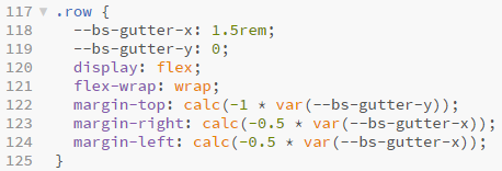
- In this example the first row gets some bottom-margin (
mb-3) for illustration purposes (it allows us to clearly seperate the different rows)
# Column (with a col class)
- Bootstrap columns are the flex items in Bootstrap's flex implementation (as described above in bootstrap_grid.css) )
- If you use the standard
colclass, Bootstrap will distribute the columns evenly across the available space - In this example the columns get
- a lightgreen
background-colorand a greenoutlineto make them stand out - some additional top-padding (
pt-2)
- a lightgreen
EMMET-TIP
Study the following Emmet instructions to set up the structure of this HTML file:
.container>header>h1^.row>(.col>h2+p)*2^.row>.col>h2+p.container.mt-3>header.mb-3>h1{Example 1}^.row.mb-3>(.col.pt-2>h2+p>lorem15)*2^.row>.col.pt-2>h2+p>lorem15
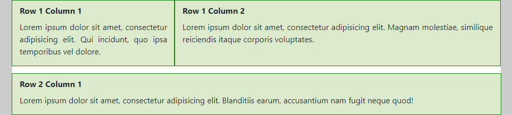
# Example 2: Different column widths
<div class="container mt-3">
    <header class="mb-3">
        <h1>Example 2</h1>
    </header>
    <div class="row mb-3">
        <div class="col-4 pt-2">
            <h2>Row 1 Column 1</h2>
            <p>Lorem ipsum dolor sit amet, consectetur adipisicing elit. Qui incidunt, quo ipsa temporibus vel dolore.</p>
        </div>
        <div class="col-8 pt-2">
            <h2>Row 1 Column 2</h2>
            <p>Lorem ipsum dolor sit amet, consectetur adipisicing elit. Magnam molestiae, similique reiciendis itaque corporis voluptates.</p>
        </div>
    </div>
    <div class="row">
        <div class="col pt-2">
            <h2>Row 2 Column 1</h2>
            <p>Lorem ipsum dolor sit amet, consectetur adipisicing elit. Blanditiis earum, accusantium nam fugit neque quod!</p>
        </div>
    </div>
</div>
body {
    background-color: #ccc;
}

h2 {
    font-size: 1rem;
}

.container {
    background-color: white;
}

.row div {
    background-color: rgba(77, 153, 0, 0.2);
    outline: 1px solid green;
    text-align: justify;
}
- If you want to define the width of the columns yourself, you can use the
col-1,col-2, … ,col-12classes - In the first row of this example, the first column (
col-4) takes up 4/12 of the available width and the second column (col-8) takes up 8/12 of the available width- Note that when using
col-X(withXa number) this division will be used on all screen sizes! - In the next example, the column widths will vary with the screen size
- Note that when using
# Example 3: Different column widths on different screen sizes
<div class="container mt-3">
    <header class="mb-3">
        <h1>Example 3</h1>
    </header>
    <div class="row mb-3">
        <div class="col-md-6 col-lg-4 pt-2">
            <h2 class="d-none d-md-block">Row 1 Column 1</h2>
            <p>Lorem ipsum dolor sit amet, consectetur adipisicing elit. Qui incidunt, quo ipsa temporibus vel dolore.</p>
        </div>
        <div class="col-md-6 col-lg-8 pt-2">
            <h2 class="d-none d-md-block">Row 1 Column 2</h2>
            <p>Lorem ipsum dolor sit amet, consectetur adipisicing elit. Magnam molestiae, similique reiciendis itaque corporis voluptates.</p>
        </div>
    </div>
    <div class="row">
        <div class="col pt-2">
            <h2 class="d-none d-md-block">Row 2 Column 1</h2>
            <p>Lorem ipsum dolor sit amet, consectetur adipisicing elit. Blanditiis earum, accusantium nam fugit neque quod!</p>
        </div>
    </div>
</div>
body {
    background-color: #ccc;
}

h2 {
    font-size: 1rem;
}

.container {
    background-color: white;
}

.row div {
    background-color: rgba(77, 153, 0, 0.2);
    outline: 1px solid green;
    text-align: justify;
}
- By adding
-sm-,-md-,-lg-or-xl-to thecol-Xclasses, we can easily make a fully responsive site without programming any breakpoints ourselves - A similar approach can be used with the display classes
d-none,d-block, ... - The result for this example:
- (Extra) Small screens
- The columns (of the first row) have the full width
- The
h2-tags are not shown
- Medium screens
- Both columns of the first row take 6/12 of the available width
- The
h2-tags are visible (again)
- (Extra) Large screens
- The first column of the first row takes 4/12 of the available width, the second column gets 8/12 of the available width
- The
h2-tags are visible
- (Extra) Small screens
# Example 4: Sum of column widths is smaller than 12
<div class="container mt-3">
    <header class="mb-4">
        <h1>Example 4</h1>
    </header>
    <div class="row mb-3">
        <div class="col-md-4">
            <h2>Row 1 Column 1</h2>
            <p>Lorem ipsum dolor sit amet, consectetur adipisicing elit. Blanditiis earum, accusantium nam fugit neque quod!</p>
        </div>
        <div class="col-md-4">
            <h2>Row 1 Column 2</h2>
            <p>Lorem ipsum dolor sit amet, consectetur adipisicing elit. Minus quo nulla distinctio, fugiat nam, fuga perferendis nesciunt ratione, repellendus earum laudantium officiis iste tempora non sequi nisi reiciendis quasi. Quae laudantium placeat sunt velit sit debitis incidunt cum, ut sapiente?</p>
        </div>
    </div>
    <div class="row mb-3 justify-content-center align-items-center">
        <div class="col-md-4">
            <h2>Row 2 Column 1</h2>
            <p>Lorem ipsum dolor sit amet, consectetur adipisicing elit. Blanditiis earum, accusantium nam fugit neque quod!</p>
        </div>
        <div class="col-md-4">
            <h2>Row 2 Column 2</h2>
            <p>Lorem ipsum dolor sit amet, consectetur adipisicing elit. Minus quo nulla distinctio, fugiat nam, fuga perferendis nesciunt ratione, repellendus earum laudantium officiis iste tempora non sequi nisi reiciendis quasi. Quae laudantium placeat sunt velit sit debitis incidunt cum, ut sapiente?</p>
        </div>
    </div>
    <div class="row">
        <div class="col-md-4">
            <h2>Row 3 Column 1</h2>
            <p>Lorem ipsum dolor sit amet, consectetur adipisicing elit. Officiis rerum, nobis libero. Aperiam veritatis, praesentium!</p>
        </div>
        <div class="col-md-4 offset-md-3">
            <h2>Row 3 Column 2</h2>
            <p>Lorem ipsum dolor sit amet, consectetur adipisicing elit. Error enim vero ex in adipisci, atque quia nobis ipsam a! Dolorum ad id, aliquam nesciunt iure hic placeat minus corporis sed harum eaque eligendi non laboriosam rem, distinctio quia consequatur atque!</p>
        </div>
    </div>
</div>
body {
    background-color: #ccc;
}

h2 {
    font-size: 1rem;
}

.container {
    background-color: white;
}

.row div {
    background-color: rgba(77, 153, 0, 0.2);
    outline: 1px solid green;
    text-align: justify;
}
- In the three rows of this example, we added 2
col-md-4columns, such that the rows are not completely filled (on medium and larger screens)- The first row shows the default behavior in this case
- In the second row, we added the classes
justify-content-centerandalign-items-centerto center the columns both horizontally and vertically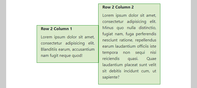
- In the third row, we use the
offset-md-3class to push the second column 3/12 to the right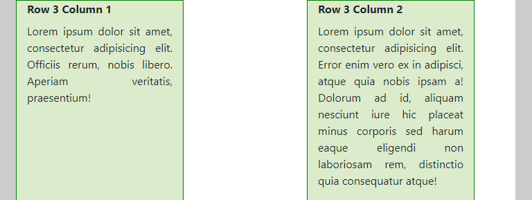
- The first row shows the default behavior in this case
# Example 5: Sum of column widths is larger than 12
<div class="container mt-3">
    <header class="mb-4">
        <h1>Example 5</h1>
    </header>
    <div class="row mb-3">
        <div class="col-md-6 order-md-4">
            <h2>Row 1 Column 1</h2>
            <p>Lorem ipsum dolor sit amet, consectetur adipisicing elit. Blanditiis earum, accusantium nam fugit neque quod!</p>
        </div>
        <div class="col-md-6">
            <h2>Row 1 Column 2</h2>
            <p>Lorem ipsum dolor sit amet, consectetur adipisicing elit. Labore cum, doloremque beatae sit tempora eum?</p>
        </div>
        <div class="col-md-6">
            <h2>Row 1 Column 3</h2>
            <p>Lorem ipsum dolor sit amet, consectetur adipisicing elit. Unde, facilis, rerum a ipsa non laboriosam.</p>
        </div>
        <div class="col-md-6 order-md-first">
            <h2>Row 1 Column 4</h2>
            <p>Lorem ipsum dolor sit amet, consectetur adipisicing elit. Labore at et quaerat harum saepe architecto.</p>
        </div>
    </div>
    <div class="row justify-content-lg-around">
        <div class="col-md-4 col-lg-4">
            <h2>Row 2 Column 1</h2>
            <p>Lorem ipsum dolor sit amet, consectetur adipisicing elit. Blanditiis earum, accusantium nam fugit neque quod!</p>
        </div>
        <div class="col-md-4 col-lg-4">
            <h2>Row 2 Column 2</h2>
            <p>Lorem ipsum dolor sit amet, consectetur adipisicing elit. Labore cum, doloremque beatae sit tempora eum?</p>
        </div>
        <div class="col-md-5 col-lg-3">
            <h2>Row 2 Column 3</h2>
            <p>Lorem ipsum dolor sit amet, consectetur adipisicing elit. Unde, facilis, rerum a ipsa non laboriosam.</p>
        </div>
        <div class="col-md-5 col-lg-3">
            <h2>Row 2 Column 4</h2>
            <p>Lorem ipsum dolor sit amet, consectetur adipisicing elit. Labore at et quaerat harum saepe architecto.</p>
        </div>
    </div>
</div>
body {
    background-color: #ccc;
}

h2 {
    font-size: 1rem;
}

.container {
    background-color: white;
}

.row div {
    background-color: rgba(77, 153, 0, 0.2);
    outline: 1px solid green;
    text-align: justify;
}

/* media query to prevent background-color change on small screens */
@media screen and (min-width: 768px) {
    .order-md-4,
    .order-md-first {
        background-color: rgba(241, 161, 122, 0.5) !important;
    }
}
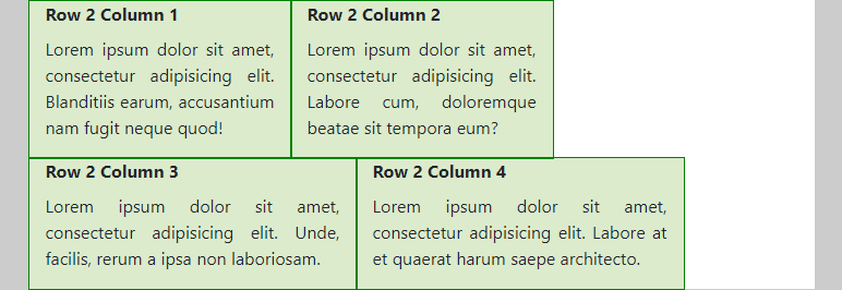
- In the two rows of this example, the total sum of the column widths is larger than 12
- The first row contains 4
col-md-6columns. As 4 x 6 = 24, the columns are placed per 2 besides each other (on medium or larger screens). - We also changed the order by adding the classes
order-md-4andorder-md-firstto the first and last column, respectively. These re-ordered colums are highlighted by giving them a differentbackground-color.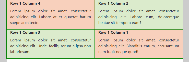
- The column widths in the second row add up to 4 + 4 + 5 + 5 = 18 (medium screens) and 4 + 4 + 3 + 3 = 14 (large screens), respectively. As expected, the columns are wrapped when insufficient space is left to place the next column.
- Medium screens
- (Extra) Large screens (notice the effect of the class
justify-content-lg-aroundon the row)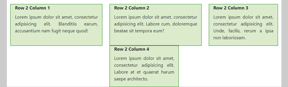
- Medium screens
- The first row contains 4
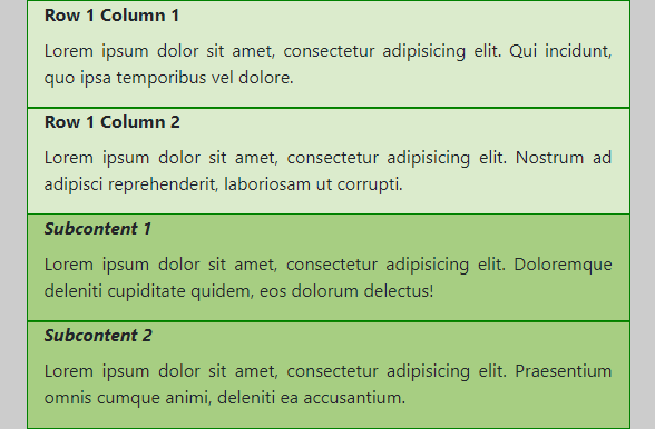
# Example 6: Nesting
<div class="container mt-3">
    <header class="mb-4">
        <h1>Example 6</h1>
    </header>
    <div class="row">
        <div class="col-md-4">
            <h2>Row 1 Column 1</h2>
            <p>Lorem ipsum dolor sit amet, consectetur adipisicing elit. Qui incidunt, quo ipsa temporibus vel dolore.</p>
        </div>
        <div class="col-md-8">
            <h2>Row 1 Column 2</h2>
            <p>Lorem ipsum dolor sit amet, consectetur adipisicing elit. Nostrum ad adipisci reprehenderit, laboriosam ut corrupti.</p>
            <div class="row">
                <div class="col-md-6">
                    <h3>Subcontent 1</h3>
                    <p>Lorem ipsum dolor sit amet, consectetur adipisicing elit. Doloremque deleniti cupiditate quidem, eos dolorum delectus!</p>
                </div>
                <div class="col-md-6">
                    <h3>Subcontent 2</h3>
                    <p>Lorem ipsum dolor sit amet, consectetur adipisicing elit. Praesentium omnis cumque animi, deleniti ea accusantium.</p>
                </div>
            </div>
        </div>
    </div>
</div>
body {
    background-color: #ccc;
}

h2, h3 {
    font-size: 1rem;
}

h3 {
    font-style: italic;
}

.container {
    background-color: white;
}

.row div {
    background-color: rgba(77, 153, 0, 0.2);
    outline: 1px solid green;
    text-align: justify;
}
- In the previous examples we got used to the process of putting columns inside rows, but it’s also possible to create more complex combinations by embedding rows inside columns and so on
- In this example, we programmed the following behavior:
- (Extra) Small screens
- Medium screens (and larger)
- Row 1 Column 1 is always 4/12 wide (
<div class="col-md-4">...</div>) - Row 1 Column 2 is always 8/12 wide (
<div class="col-md-8">...</div>)- Subcontent1 and Subcontent2 are equally wide
- Within
<div class="col-md-8">...</div>, we define arowthat contains two<div class="col-md-6">...</div>elements
- Notice that this nested row again consists of 12 columns. So
col-md-6takes half of the available space in this nested row (which is not the whole container width, but 8/12 of it as defined in the enclosing<div class="col-md-8">...</div>).
- Row 1 Column 1 is always 4/12 wide (
- (Extra) Small screens