# Positioning
- The
positionproperty is used to indicate that an element is explicitly positioned - The possibilities are static, relative, absolute, fixed, sticky (and
inherit)
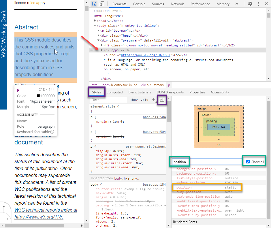
# Static
- When the
positionproperty is omitted, the browser usesposition: staticas the default value - Open https://www.w3.org/TR/css-values/
- Select, within DevTools, a random paragraph on the page
- Go to the Styles tab, and make sure the Computed Styles sidebar is shown (or go directly to the Computed tab)
- Check the Show all checkbox and filter on
positionto find the default positioning of that paragraph
# Relative
position: relativemoves an element relative to the original spot in the static flow- Use the
top/bottomand/orleft/rightproperties to move the element
(You don't see any movement iftop/bottomandleft/rightis omitted!)
- Use the
- A relatively positioned element preserves its space: the spot in the static flow is kept open
# Interactive demo
- Open position_relative.html and experiment with the different settings
# Use cases
position: relativeis mainly used in conjunction with absolutely positioned elements (see further on)- The
left/rightandtop/bottomproperties can be omitted in combination with absolute positioning
- The
# Absolute
position: absolutemoves an element to a specific spot on the page- Use the
top/bottomand/orleft/rightproperties to position the element
- Use the
- An absolutely positioned element is positioned relative to its closest (relatively) positioned ancestor!
- If none of its ancestors are positioned, the element is positioned relative to the
bodytag
- If none of its ancestors are positioned, the element is positioned relative to the
- An absolutely positioned element is removed completely from the normal flow: the adjacent sibling elements occupy its space
# Interactive demo
- Open position_absolute.html and experiment with the different settings
REMARK
By setting the position of a (block) element to absolute (or fixed, see below), its width and height are set to auto and, thus, based on its content. Depending on your use case, you might have to adjust the width and/or height of the absolutely positioned element (in px, % of parent width/height, vw/vh, ...).
# Use cases
- Place logo/watermark on top of another element
- Place an overlay on top of images, e.g. Flickr
- Place an overlay on top of the body tag, e.g. Lightbox
# Fixed
- An element with
position: fixedis always positioned relative to the viewport- This means that it always stays at the same place, even if the page is scrolled
- Use the
top/bottomand/orleft/rightproperties to position the element
- A fixed element does not leave a gap in the page where it would normally have been located
# Interactive demo
- Open position_fixed.html and experiment with the different settings
# Use cases
- Fixed navbar always on top of the page, e.g. Stack Overflow
- Fixed sidenav on the left/right side of the page like on this course page/website
- 'back-to-top' button on the left/right bottom of the page like on this course page/website
- Fixed footer at the bottom of the page
- Fixed cookie/privacy overlay
# Sticky
position: stickyis a hybrid of static and fixed positioning- The element is positioned according to the normal static flow until it crosses a specified threshold value determined by
top/bottomorleft/right, e.g. by scrolling. At this point the element "sticks" in place, i.e., is positioned in a fixed way. - You must specify at least one of the
top/bottomorleft/rightproperties for sticky positioning to work
- The element is positioned according to the normal static flow until it crosses a specified threshold value determined by
# Interactive demo
- Open position_sticky.html and experiment with the different settings
# Use cases
- A sticky navbar when the title is above the navigation, e.g. W3Schools CSS Tutorial
- Note that the navbar on this page acts as a sticky navbar, although it is implemented with JavaScript (and not using
position: sticky)
- Note that the navbar on this page acts as a sticky navbar, although it is implemented with JavaScript (and not using
REMARK
position: stickyis the only property from this list that is not fully supported (yet) on all major browsers- E.g. it's not supported on the
theadand on thetrtag inside Chromium browsers
- E.g. it's not supported on the

# Emmet
| EMMET instruction | result |
|---|---|
pos:r^t50^l-100 + TAB | position: relative;top: 50px;left: -100px; |
pos:a^t75^l75 + TAB | position: absolute;top: 75px;left: 75px; |
pos:f^t40 + TAB | position: fixed;top: 40px; |
# Stacking order
- If you start working with
position: relative,position: absolute,position: fixedorposition: sticky, it can happen that elements are stacked on top of each other - For elements that do not have
position: static, you can control the stacking order via thez-indexproperty- An element with a larger
z-indexis always in front of an element with a smallerz-index - Tip: use a negative
z-indexto move an element behind its parent element
- An element with a larger
# Interactive demo
- Open z-index.html and experiment with the different settings~~
# Sticky Footer
- A sticky footer is a footer that stays at the bottom of the page, even when content doesn't fill the entire viewport. This can be achieved by:
- Setting
min-height: 100vhon thebodyto make sure the body will cover the entire screen height - Adding
padding-bottomto create some space - Positioning the footer in that created space with
position: absolute
- Setting
<body>
    <header>
        <h1>HTML Ipsum Presents</h1>
    </header>
    <article>
        <p>Lorem ipsum...</p>
    </article>
    <footer>
        <p>Contact info...</p>
    </footer>
</body>
/* Universal reset */
* {
    margin: 0;
    padding: 0;
    box-sizing: border-box;
}

body {
    position: relative;
    min-height: 100vh;
    padding-bottom: 50px;
}

footer {
    position: absolute;
    bottom: 0;
    height: 50px;
    width: 100%;

    /* Styling */
    background-color: blue;
    color: white;
    padding: 10px;
}