# Box model
- Every HTML element is essentially a rectangular box
- You need to understand the box model in depth to make a nice layout!
# Box info
- Select any element on a random webpage and open Chrome's dev tools (
F12) to take a closer look at the box of this element
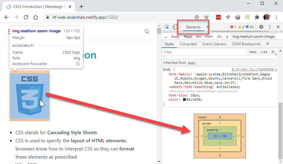
- Each box (element) consists of four parts:
- content of the element (can be text, an image, ...)
- border of the element
- padding or distance between the content and the border
- margin or distance between two adjoining elements
# Border
- We already discussed borders in detail on the separate Borders page
# Padding
- In order to specify padding, you can either specify
padding-top,padding-right,padding-bottomandpadding-leftseparately, or use the shorthand propertypadding(recommended) - The shorthand property
paddingcan have one, two, three (rarely used) or four values:- one value: equal distances for all four values
- two values: first value for top and bottom, second value for left and right
- three values: first value for top, second value for left AND right, third value for bottom
- four values: (clockwise values) first value for top, second value for right, third value for bottom and fourth value for left
| EMMET instruction | result | top | right | bottom | left |
|---|---|---|---|---|---|
pt20 + TAB | padding-top: 20px; | 20px | - | - | - |
pr10 + TAB | padding-right: 10px; | - | 10px | - | - |
pb0 + TAB | padding-bottom: 0; | - | - | 0px | - |
pl2rem + TAB | padding-left: 2rem; | - | - | - | 2rem |
p20 + TAB | padding: 20px; | 20px | 20px | 20px | 20px |
p20-10 + TAB | padding: 20px 10px; | 20px | 10px | 20px | 10px |
p20-10-30 + TAB | padding: 20px 10px 30px; | 20px | 10px | 30px | 10px |
p20-10-0-2rem + TAB | padding: 20px 10px 0 2rem; | 20px | 10px | 0px | 2rem |
# Example
<h1>Padding</h1>
<article class="info">
<h2>Info</h2>
<p>Lorem ipsum dolor sit amet, consectetur adipisicing elit. Illo magni id iste fugiat. Recusandae, officia nostrum blanditiis esse velit sed optio molestiae perspiciatis iste, minus aut quam commodi repudiandae, voluptas adipisci similique ipsam fugiat quidem, eum laboriosam excepturi inventore maxime eveniet rerum? Harum aliquam accusantium illo debitis deleniti aut necessitatibus.</p>
</article>
<figure>
<img
class="frame"
src="https://picsum.photos/id/124/300/200"
alt="boat on the lake" />
<figcaption>© Anton Sulsky</figcaption>
</figure>
html {
    font-size: 14px;
}

 body {
    font-family: Verdana, Geneva, sans-serif;
    line-height: 1.5;
}

h1 {
    font-size: 2rem;
}

h2 {
    font-size: 1.3rem;
}

.info {
    text-align: justify;
    border-left: .5rem solid #42b983;
    background-color: #f3f5f7;
    padding: .1rem 1.5rem;
}

.frame {
    border: 1px solid rgba(23, 22, 22, .5);
    background-color: #f3f5f7;
    box-shadow: 3px 3px 5px rgba(0, 0, 0, .3);
    padding: 1.5rem;
}
# Margin
- Just like for padding, you can either specify
margin-top,margin-right,margin-bottomandmargin-leftseparately, or use the shorthand propertymargin(recommended)
| EMMET instruction | result | top | right | bottom | left |
|---|---|---|---|---|---|
mt20 + TAB | margin-top: 20px; | 20px | - | - | - |
mr10 + TAB | margin-right: 10px; | - | 10px | - | - |
mb0 + TAB | margin-bottom: 0; | - | - | 0px | - |
ml2rem + TAB | margin-left: 2rem; | - | - | - | 2rem |
ml:a + TAB | margin-left: auto; | - | - | - | auto |
m20 + TAB | margin: 20px; | 20px | 20px | 20px | 20px |
m20-10 + TAB | margin: 20px 10px; | 20px | 10px | 20px | 10px |
m0-auto + TAB | margin: 0 auto; | 0px | auto | 0px | auto |
m20-10-30 + TAB | margin: 20px 10px 30px; | 20px | 10px | 30px | 10px |
m20-10-0-2rem + TAB | margin: 20px 10px 0 2rem; | 20px | 10px | 0px | 2rem |
# Example
<h1>Margin</h1>
<p class="m1">Lorem ipsum dolor sit amet, consectetur adipisicing elit. Expedita sequi, voluptatibus accusantium quidem eligendi quaerat impedit nihil tempore omnis dicta!</p>
<p class="m2">Maxime temporibus nisi sequi dolorum dicta, deserunt accusantium! Corporis deleniti consequuntur aperiam, odit aspernatur ut minus ipsum id hic quidem!</p>
<p class="m1">Laudantium libero amet sit perspiciatis molestiae, non iste temporibus? Explicabo distinctio sequi repellendus necessitatibus omnis, soluta non nesciunt ipsa suscipit.</p>
<p class="m1">Eaque, excepturi, in voluptas dolores numquam quia cupiditate, esse nesciunt iste iusto iure. Debitis numquam, incidunt animi id quisquam, magni?</p>
<p class="m1">Eaque quia aperiam necessitatibus, fugiat nam repellat! Veritatis culpa voluptate officia alias corrupti ducimus, eos pariatur, facere, quae, magni in!</p>
<figure>
<img class="m1" src="https://picsum.photos/id/153/131/100" alt="image 1" width="150" height="100" />
<img class="m1" src="https://picsum.photos/id/134/150/100" alt="image 2" width="150" height="100" />
<img class="m1" src="https://picsum.photos/id/129/150/100" alt="image 3" width="150" height="100" />
<figcaption>© Charlie Foster</figcaption>
</figure>
html {
    font-size: 14px;
}

body {
    font-family: Verdana, Geneva, sans-serif;
    line-height: 1.5;
    padding: 1rem;
    margin: 0;
    background-size: 1rem 1rem;
    background-image:
        linear-gradient(rgba(0, 0, 255, .3), transparent 1px),
        linear-gradient(90deg, rgba(0, 0, 255, .3), transparent 1px);
}

h1 {
    font-size: 1.5rem;
    line-height: 2rem;
}

figure {
    padding: 0;
    margin: 0;
}

.m1, .m2 {
    background-color: rgba(241, 161, 122, 0.5);
    border: 1px solid #000;
    padding: 1rem;
    margin: 1rem;
}

.m2 {
    margin: 2rem;
    background-color: rgba(239, 241, 122, 0.5);
}
WARNING
To better show the difference in padding and margin, we used a background pattern. You will learn how to make one in the Background Images chapter.
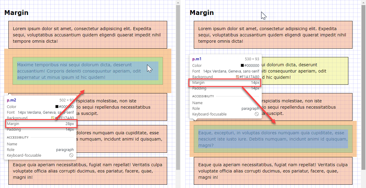
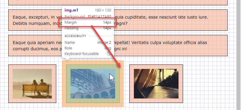
- The margin of an orange block (
.m1) is1rem(or14px), the margin of a yellow block (.m2) is2rem(or28px) - The
bodyhas a background grid with a spacing of1rem(or14px) - Margins behave somewhat different than paddings
- For block elements (
div,p,hx,article, ...) the real margin (shown in the browser) is the largest top/bottom margin of the two adjacent elements
- For inline and floating elements (
img,a,span, ...) the real margin (shown in the browser) is the sum of two adjacent elements
- For block elements (
# Box-sizing
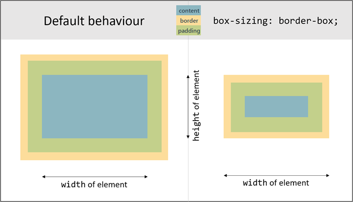
- By default, the real width/height of an element (shown in the browser) is:
- real width:
widthof the element +padding+border - real height:
heightof the element +padding+border
- real width:
- This is very annoying if you want to place elements nicely next to each other (see later in this course: Flexbox)
- Therefore, we always add an extra style rule (
box-sizing: border-box;) to the element that makes the real width/height of the element equal to the (given)width/heightof the element (i.e. without the padding and the border). The padding and the border are moved "into" the element, respecting the values ofwidth/heightrather than enlarging these values.
# Example
<h1>Box-sizing</h1>
<p class="box1">Lorem ipsum dolor sit amet, consectetur adipisicing elit. Expedita sequi, voluptatibus accusantium quidem eligendi quaerat impedit nihil tempore omnis dicta!</p>
<p class="box2">Maxime temporibus nisi sequi dolorum dicta, deserunt accusantium! Corporis deleniti consequuntur aperiam, odit aspernatur ut minus ipsum id hic quidem!</p>
html {
    font-size: 14px;
}

body {
    font-family: Verdana, Geneva, sans-serif;
    line-height: 1.5;
    padding: 1rem;
    margin: 0;
    background-size: 1rem 1rem;
    background-image:
        linear-gradient(rgba(0, 0, 255, .3), transparent 1px),
        linear-gradient(90deg, rgba(0, 0, 255, .3), transparent 1px);
}

h1 {
    font-size: 1.5rem;
    line-height: 2rem;
}

.box1, .box2 {
    background-color: rgba(190, 241, 122, .5);
    border: 1rem solid rgba(255, 0, 0, .5);
    width: 20rem;
    padding: 1rem;
    margin: 1rem 0;
}

.box2 {
    background-color: rgba(122, 239, 241, .5);
    box-sizing: border-box;
}
- Take a closer look at the two boxes
.box1, .box2 {
    background-color: rgba(190, 241, 122, .5);
    border: 1rem solid rgba(255, 0, 0, .5);
    width: 20rem;
    padding: 1rem;
    margin: 1rem 0;
}

.box2 {
    background-color: rgba(122, 239, 241, .5);
    box-sizing: border-box;
}
1
2
3
4
5
6
7
8
9
10
11
12- Both elements have a width of
20rem, a padding and border of1rem - Only the second element, with class
box2, has the style rulebox-sizing: border-box; - The real width of the elements:
- real width of
.box1:widthproperty + 2 times thepadding+ 2 times theborder=24rem(or 24 gridlines) - real width of
.box2: only thewidthproperty =20rem(or 20 gridlines)
- real width of
- Both elements have a width of
| EMMET instruction | result |
|---|---|
bxz + TAB | -webkit-box-sizing: border-box;-moz-box-sizing: border-box; box-sizing: border-box; |
# Universal reset
- The universal selector (the
*selector) selects EVERY element on the page - The universal reset will be used to set some default values for every element on the page
- Afterwards, you can overwrite these values for every element that needs a different value
- Place the universal reset always at the top of your CSS file (remember the cascading effect inside a CSS file)
* {
    margin: 0;
    padding: 0;
    box-sizing: border-box;
}
1
2
3
4
5
2
3
4
5
| EMMET instruction | result |
|---|---|
m0+p0+bxz + TAB | margin: 0;padding: 0;-webkit-box-sizing: border-box;-moz-box-sizing: border-box; box-sizing: border-box; |
DESIGN TIP
You can use the universal selector to change the background-color of all selected text on your website.
<h1>Change background of selected text</h1>
<p>Lorem ipsum dolor sit amet, consectetur adipisicing elit. Expedita sequi, voluptatibus accusantium quidem eligendi quaerat impedit nihil tempore omnis dicta!</p>
*::selection {
    color: white;
    background-color: darkred;
}
REMARK
- The Emmet instruction
bxzproduces two extra lines with a vendor prefix (-webkit-and-moz-)- Vendor prefixes will be discussed later in Webdesign advanced
- You can easily delete these lines because all major browsers support the
box-sizingproperty
* {
    margin: 0;
    padding: 0;
    -webkit-box-sizing: border-box;
    -moz-box-sizing: border-box;
    box-sizing: border-box;
}
1
2
3
4
5
6
7
2
3
4
5
6
7

# Horizontally centred box
- To keep a web page readable on a large screen, the entire content is often limited to a certain (maximum) width and centred on the page
- To do this you have to:
- give the container (a block element with all the content) a fixed
widthormax-width - centre the container by setting the
margin-leftandmargin-righttoauto
.container {
    max-width: 800px;
    margin-left: auto;
    margin-right: auto;
}
1
2
3
4
5 - give the container (a block element with all the content) a fixed
# Example 1
<div class="container">
    <h1>Horizontally centred box</h1>
    <p>Lorem ipsum dolor sit amet, consectetur adipisicing elit. Expedita sequi, voluptatibus accusantium quidem eligendi quaerat impedit nihil tempore omnis dicta!</p>
    <p>Maxime temporibus nisi sequi dolorum dicta, deserunt accusantium! Corporis deleniti consequuntur aperiam, odit aspernatur ut minus ipsum id hic quidem!</p>
</div>
* {
    margin: 0;
    padding: 0;
    box-sizing: border-box;
}

html {
    font-size: 20px;
}

body {
    font-family: Verdana, Geneva, sans-serif;
    line-height: 1.5;
    padding: 1rem;
    background-color: rgb(245, 166, 166);
}

.container {
    background-color: white;
    border: 1px solid #000;
    max-width: 600px;
    padding: 1rem;
    margin: 0 auto;
}
# Example 2
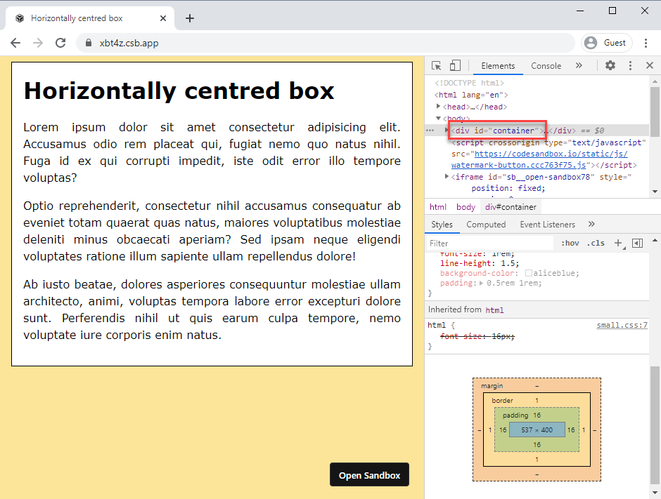
- Examine the code in the Sandbox and try to figure out how the page behaves at the different breaking points
- Open the Sandbox in a new browser window https://xbt4z.csb.app/
- Observe how the
background-colorofbodychanges over the different breakpoints - Use Chrome's dev tools to examine the width of
#containerat different breakpoints ( < 600px, >= 600px and < 800px, >= 800px)
- Observe how the
# Debugging tip
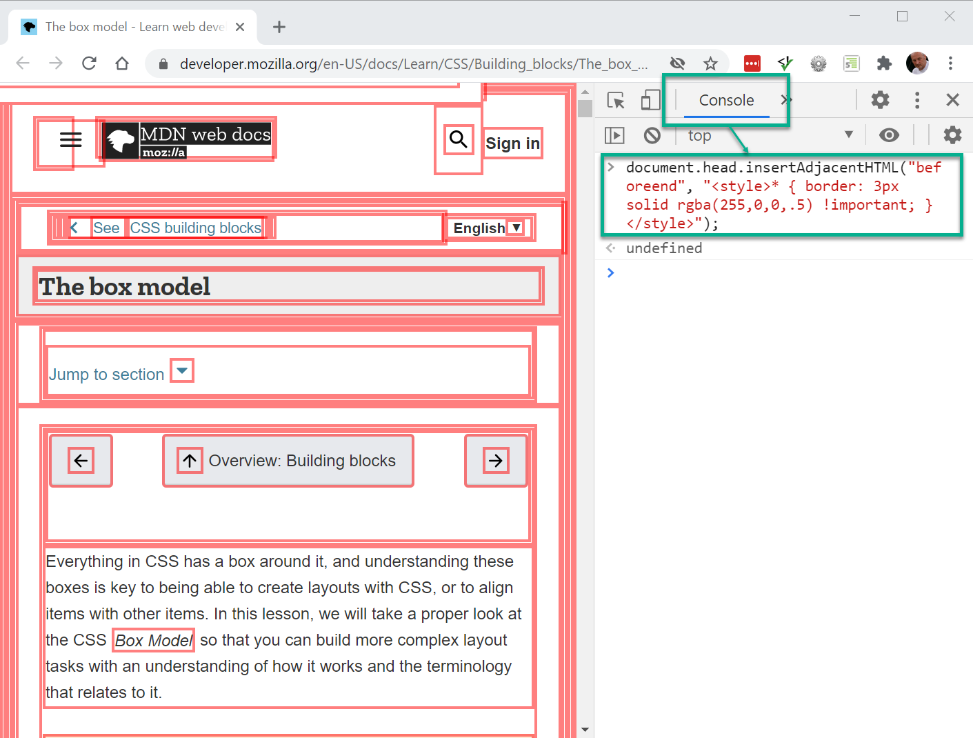
- Sometimes your layout doesn't look quite as you would expect it to
- Often this has to do with the box model that presents itself differently than expected
- You can add a (temporary) border around one (or more) element(s) to visualise its box(es)
- The disadvantage of this technique is that you influence the complete layout of the box(es) and your overall design
- Let's try it on a random webpage, e.g: mozilla box model info
- Open Chrome's developer tools
- Inject a JavaScript that draws a border of 3 pixels around every element on the page and look how the layout shifts 😏
- Go to the Console tab and paste this code just after the > sign:
document.head.insertAdjacentHTML("beforeend", "<style> * { border: solid 3px rgba(255,0,0,.5) !important; }</style>");
1
# Outline
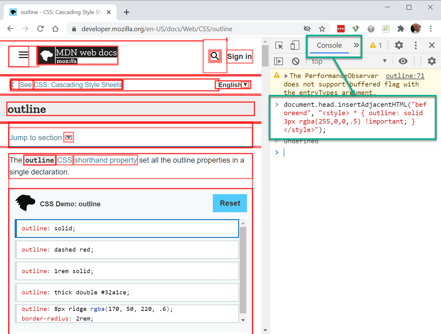
- The
outlineproperty also draws a border around the outside of an element (outside its border if there is one) - Because this property is NOT part of the box model, it won’t affect the position of the element or adjacent elements (no shifts take place in the overall layout)
- Let's try it on another random webpage, e.g: mozilla outline info
- Open Chrome's developer tools
- Inject a JavaScript that draws an outline of 3 pixels around every element on the page. No shifts in the layout this time 😃
- Go to the Console tab and past this code just after the > sign:
document.head.insertAdjacentHTML("beforeend", "<style> * { outline: solid 3px rgba(255,0,0,.5) !important; }</style>");
1
TIP
If you want to (temporarily) visualise your boxes for debugging, use the outline property and not the border property
REMARKS
- In contrast to the
borderproperty, theoutlineproperty always draws an outline around all the sides of an element, you can’t specify particular sides outlineis also used for the defaulta:focusstyle on links
# Outline-offset (optional)
- You can also use the
outlineproperty for nice, visual effects in your design - With a second property,
outline-offset, you can move the outline further away (positive number) from the box or even inside (negative number) the box
<h1>Outline with offset</h1>
<figure>
    <img src="https://picsum.photos/id/59/600/400" alt="Field">
    <figcaption>Field by Art Wave</figcaption>
</figure>
* {
    margin: 0;
    padding: 0;
    box-sizing: border-box;
}

html {
    font-size: 16px;
}

body {
    font-family: Verdana, Geneva, sans-serif;
    line-height: 1.5;
    padding: 2rem;
}

h1 {
    margin-bottom: 2rem;
}

img {
    padding: .5rem;
    border: 3px solid #9f9f9f;
    outline: 10px solid rgba(255, 255, 255, 0.39);
    outline-offset: -2rem;
}

figcaption {
    font-size: .9rem;
    font-variant: small-caps;
    font-weight: bold;
    color: #9f9f9f;
}
| EMMET instruction | result |
|---|---|
ol + TAB | outline: ; |
ol5-solid-black + TAB | outline: 5px solid black; |
olo + TAB | outline-offset: ; |
olo1rem + TAB | outline-offset: 1rem; |
# Overflow
- What happens if the content of an element doesn't fit within the fixed dimensions (
widthandheight) of the element?- By default, the content crosses the boundaries of the box (
overflow: visible) - You can change this behavior by setting the
overflowproperty tohidden,autoorscroll
- By default, the content crosses the boundaries of the box (
| EMMET instruction | result |
|---|---|
ov + TAB | overflow: hidden; |
ov:h + TAB | overflow: hidden; |
ov:s + TAB | overflow: scroll; |
ov:a + TAB | overflow: auto; |
REMARK
The examples below only "overflow" in the vertical direction. In these cases, you also might use the overflow-y property which solely specifies the behavior of content that is too large for a given height. Likewise, the overflow-x property can be used to specifically tune the behavior of horizontal overflows.
# Visible (default)
- The content flows over the box if the
heightis too small
div {
    background-color: white;
    border: 1px solid gray;
    padding: 1rem;
    height: 190px;
}
1
2
3
4
5
6
2
3
4
5
6
<h1>No overflow value</h1>
<div>
    <p>Lorem ipsum dolor sit amet, consectetur adipisicing elit. Sequi nemo corporis, deserunt at tenetur fugit consequuntur, iste nihil, ratione neque assumenda magnam hic commodi rem ipsum vel nostrum adipisci officiis!</p>
    <p>Et suscipit, sapiente dolorum ab, harum est vel magnam deleniti in consequatur fugit nisi. Enim, nihil ad sunt ratione sapiente repellendus, in. Beatae ipsam nihil, impedit nisi, laborum error accusantium?</p>
</div>
* {
    padding: 0;
    margin: 0;
    box-sizing: border-box;
}

html {
    font-size: 16px;
}

body {
    font-family: Verdana, Geneva, sans-serif;
    line-height: 1.5;
    padding: 1rem;
    background-color: lightcoral;
}

div {
    background-color: white;
    border: 1px solid gray;
    padding: 1rem;
    height: 190px;
}

p {
    margin-bottom: 1rem;
}
# Hidden
- The content is cut off if the
heightis too small
div {
    background-color: white;
    border: 1px solid gray;
    padding: 1rem;
    height: 190px;
    overflow: hidden;
}
1
2
3
4
5
6
7
2
3
4
5
6
7
<h1>overflow: hidden;</h1>
<div>
    <p>Lorem ipsum dolor sit amet, consectetur adipisicing elit. Sequi nemo corporis, deserunt at tenetur fugit consequuntur, iste nihil, ratione neque assumenda magnam hic commodi rem ipsum vel nostrum adipisci officiis!</p>
    <p>Et suscipit, sapiente dolorum ab, harum est vel magnam deleniti in consequatur fugit nisi. Enim, nihil ad sunt ratione sapiente repellendus, in. Beatae ipsam nihil, impedit nisi, laborum error accusantium?</p>
</div>
* {
    padding: 0;
    margin: 0;
    box-sizing: border-box;
}

html {
    font-size: 16px;
}

body {
    font-family: Verdana, Geneva, sans-serif;
    line-height: 1.5;
    padding: 1rem;
    background-color: lightcoral;
}

div {
    background-color: white;
    border: 1px solid gray;
    padding: 1rem;
    height: 190px;
    overflow: hidden;
}

p {
    margin-bottom: 1rem;
}
# Auto
- The box only gets a scroll bar if the content exceeds the
height
div {
    background-color: white;
    border: 1px solid gray;
    padding: 1rem;
    margin-bottom: 1rem;
    height: 190px;
    overflow: auto;
}
1
2
3
4
5
6
7
8
2
3
4
5
6
7
8
<h1>overflow: auto;</h1>
<div>
    <p>Lorem ipsum dolor sit amet, consectetur adipisicing elit. Sequi nemo corporis, deserunt at tenetur fugit consequuntur, iste nihil, ratione neque assumenda magnam hic commodi rem ipsum vel nostrum adipisci officiis!</p>
    <p>Et suscipit, sapiente dolorum ab, harum est vel magnam deleniti in consequatur fugit nisi. Enim, nihil ad sunt ratione sapiente repellendus, in. Beatae ipsam nihil, impedit nisi, laborum error accusantium?</p>
</div>
<div>
    <p>Lorem ipsum dolor sit amet, consectetur adipisicing elit. Sequi nemo corporis, deserunt at tenetur fugit consequuntur, iste nihil, ratione neque assumenda magnam hic commodi rem ipsum vel nostrum adipisci officiis!</p>
</div>
* {
    padding: 0;
    margin: 0;
    box-sizing: border-box;
}

html {
    font-size: 16px;
}

body {
    font-family: Verdana, Geneva, sans-serif;
    line-height: 1.5;
    padding: 1rem;
    background-color: lightcoral;
}

div {
    background-color: white;
    border: 1px solid gray;
    padding: 1rem;
    margin-bottom: 1rem;
    height: 190px;
    overflow: auto;
}

p {
    margin-bottom: 1rem;
}
# Scroll
- The box always gets a scroll bar, even if the content fits the
height
div {
    background-color: white;
    border: 1px solid gray;
    padding: 1rem;
    margin-bottom: 1rem;
    height: 190px;
    overflow: scroll;
}
1
2
3
4
5
6
7
8
2
3
4
5
6
7
8
<h1>overflow: scroll;</h1>
<div>
    <p>Lorem ipsum dolor sit amet, consectetur adipisicing elit. Sequi nemo corporis, deserunt at tenetur fugit consequuntur, iste nihil, ratione neque assumenda magnam hic commodi rem ipsum vel nostrum adipisci officiis!</p>
    <p>Et suscipit, sapiente dolorum ab, harum est vel magnam deleniti in consequatur fugit nisi. Enim, nihil ad sunt ratione sapiente repellendus, in. Beatae ipsam nihil, impedit nisi, laborum error accusantium?</p>
</div>
<div>
    <p>Lorem ipsum dolor sit amet, consectetur adipisicing elit. Sequi nemo corporis, deserunt at tenetur fugit consequuntur, iste nihil, ratione neque assumenda magnam hic commodi rem ipsum vel nostrum adipisci officiis!</p>
</div>
* {
    padding: 0;
    margin: 0;
    box-sizing: border-box;
}

html {
    font-size: 16px;
}

body {
    font-family: Verdana, Geneva, sans-serif;
    line-height: 1.5;
    padding: 1rem;
    background-color: lightcoral;
}

div {
    background-color: white;
    border: 1px solid gray;
    padding: 1rem;
    margin-bottom: 1rem;
    height: 190px;
    overflow: scroll;
}

p {
    margin-bottom: 1rem;
}